

Create Responsive UI in Flutter: Choose the Right Layout Widget
Introduction
Introduction
Introduction
Introduction
Did you know that layout plays a pivotal role in shaping the user experience of your Flutter app? It's not just about arranging widgets on the screen; it's about creating an interface that users find intuitive, engaging, and easy to navigate.
Engaging Fact: The layout system in Flutter is based on a reactive framework that automatically adjusts to changes in the UI, making it incredibly efficient and flexible.
Question: Have you ever wondered why some apps feel seamless and effortless to use, while others leave you feeling confused and frustrated? The answer often lies in the way their layouts are designed.
Explanation of Layout:
At its core, layout in Flutter refers to the process of arranging UI elements, or widgets, on the screen in a structured and visually appealing manner. It involves determining the size, position, and alignment of widgets to create a cohesive user interface.
In Flutter, layout is achieved through the use of layout widgets, which serve as building blocks for constructing UIs. These widgets provide various layout algorithms and mechanisms for organizing and structuring the UI according to the design requirements.
Importance of Layout:
Layout is not just a superficial aspect of app design; it's a critical component that directly impacts the user experience. A well-designed layout enhances usability, facilitates navigation, and creates a sense of familiarity for users, leading to increased engagement and satisfaction.
Imagine trying to navigate a cluttered and disorganized interface with overlapping elements and inconsistent spacing. It's not only frustrating but also detracts from the overall user experience. On the other hand, a thoughtfully designed layout guides users smoothly through the app, making interactions intuitive and enjoyable.
In the competitive world of app development, where user retention and engagement are paramount, the importance of layout cannot be overstated. By prioritizing layout design and paying attention to the smallest details, you can create user interfaces that are not only visually appealing but also highly functional and user-friendly.
Understanding Layout in Flutter
Understanding Layout in Flutter
Understanding Layout in Flutter
Understanding Layout in Flutter
In today's digital landscape, crafting a responsive user interface (UI) is crucial for app success. This guide explores Flutter layout widgets, aiding in the selection of the ideal one for your UI design needs. At the core of Flutter’s layout mechanism are widgets—the building blocks of UI design. From visible elements like images and icons to unseen components like rows and columns, everything in Flutter is a widget. By composing widgets, you construct layouts that align with UI design principles, ensuring seamless user experiences in your Flutter app development journey.
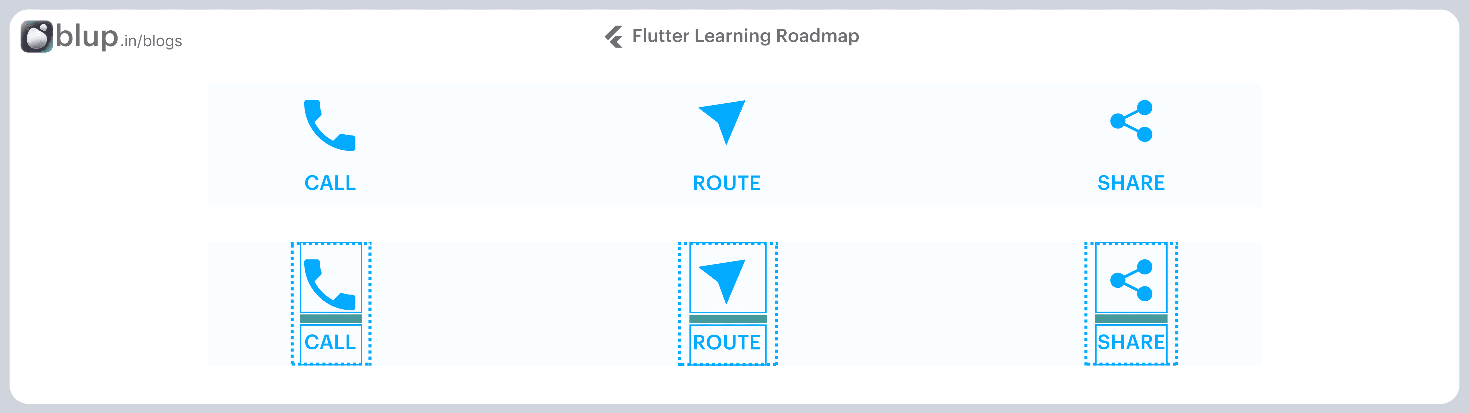
The second screenshot displays the visual layout, showing a row of 3 columns where each column contains an icon and a label.
Here’s a diagram of the widget tree for this UI:
Most of this should look as you might expect, but you might be wondering about the containers (shown in pink). Container is a widget class that allows you to customize its child widget. Use a Container when you want to add padding, margins, borders, or background color, to name some of its capabilities.
In this example, each Text widget is placed in a Container to add margins. The entire Row is also placed in a Container to add padding around the row.
The rest of the UI in this example is controlled by properties. Set an Icon’s color using its color property. Use the Text.style property to set the font, its color, weight, and so on. Columns and rows have properties that allow you to specify how their children are aligned vertically or horizontally, and how much space the children should occupy.
While most elements look familiar, you might be curious about the pink boxes. These are Containers, widgets that let you customize their content. Use them to add features like padding, margins, borders, and background colors.
In this example, each Text is wrapped in a Container for margins. The entire Row is also placed within a Container to add padding.
Beyond Containers, most UI elements have properties to control their appearance. For example, set an Icon's color with its color property. Use the Text.style property to adjust font, color, weight, and more. Rows & columns offer properties for child alignment and spacing.
In today's digital landscape, crafting a responsive user interface (UI) is crucial for app success. This guide explores Flutter layout widgets, aiding in the selection of the ideal one for your UI design needs. At the core of Flutter’s layout mechanism are widgets—the building blocks of UI design. From visible elements like images and icons to unseen components like rows and columns, everything in Flutter is a widget. By composing widgets, you construct layouts that align with UI design principles, ensuring seamless user experiences in your Flutter app development journey.
The second screenshot displays the visual layout, showing a row of 3 columns where each column contains an icon and a label.
Here’s a diagram of the widget tree for this UI:
Most of this should look as you might expect, but you might be wondering about the containers (shown in pink). Container is a widget class that allows you to customize its child widget. Use a Container when you want to add padding, margins, borders, or background color, to name some of its capabilities.
In this example, each Text widget is placed in a Container to add margins. The entire Row is also placed in a Container to add padding around the row.
The rest of the UI in this example is controlled by properties. Set an Icon’s color using its color property. Use the Text.style property to set the font, its color, weight, and so on. Columns and rows have properties that allow you to specify how their children are aligned vertically or horizontally, and how much space the children should occupy.
While most elements look familiar, you might be curious about the pink boxes. These are Containers, widgets that let you customize their content. Use them to add features like padding, margins, borders, and background colors.
In this example, each Text is wrapped in a Container for margins. The entire Row is also placed within a Container to add padding.
Beyond Containers, most UI elements have properties to control their appearance. For example, set an Icon's color with its color property. Use the Text.style property to adjust font, color, weight, and more. Rows & columns offer properties for child alignment and spacing.
Selecting Layout Widgets
Selecting Layout Widgets
Selecting Layout Widgets
Selecting Layout Widgets
Flutter offers various layout widgets, each designed to fulfill specific layout needs. From simple containers to complex grid views, these widgets provide the flexibility and functionality required to create dynamic user interfaces. Some common layout widgets include Container, Row, Column, Stack, ListView, GridView, Expanded, and Flexible. By exploring the capabilities of each widget, developers gain insight into their unique features and suitability for different layout scenarios.
Choosing the Right Widget: Choosing the right layout widget requires a thoughtful approach. As you embark on this journey, consider factors like screen size, content structure, and interaction patterns. Whether it's a scrollable list with ListView, a dynamic arrangement with Row or Column, or the powerful flexibility of Stack, understanding their nuances empowers you to make informed decisions.
Create a visible widget
Design and customize the visual aspect of the widget.
For example, create a Text widget:
Text('Hello World'),Create an Image widget:
return Image.asset(
  image,
  fit: BoxFit.cover,
);
Create an Icon widget:
Icon(
  Icons.star,
  color: Colors.red[500],
),
Add the visible widget to the layout widget
All layout widgets have either of the following:
A
childproperty if they take a single child—for example,CenterorContainerA
childrenproperty if they take a list of widgets—for example,Row,Column,ListView, orStack.
Add the Text widget to the Center widget:
content_copyconst Center( child: Text('Hello World'), ),
4. Add the layout widget to the page
A Flutter app is itself a widget, and most widgets have a build() method. Instantiating and returning a widget in the app’s build() method displays the widget.
Building Blocks of Layout Design
Building Blocks of Layout Design
Building Blocks of Layout Design
Building Blocks of Layout Design
The "Building Blocks of Layout Design" refers to the fundamental components and processes involved in structuring and organizing user interface (UI) elements within a Flutter application. These building blocks serve as the foundation for creating visually appealing, functional, and responsive UI layouts.
In the context of Flutter, the building blocks of layout design typically include:
Selecting a Layout Widget: Choosing an appropriate layout widget from Flutter's extensive library, such as
Container,Row,Column,Stack,ListView,GridView,Expanded, orFlexible, based on the specific design requirements and UI layout goals.Creating Visible Widgets: Designing and customizing the visual appearance of individual UI elements, such as buttons, text fields, images, and other widgets, to match the overall design aesthetics and user experience (UX) goals of the application.
Adding Visible Widgets to Layout Widgets: Incorporating the visible widgets into the selected layout widgets to define their positioning, sizing, and arrangement within the UI layout. This step involves nesting widgets within one another and configuring layout properties to achieve the desired UI structure.
Adding Layout Widgets to the Page: Integrating the layout widgets containing visible widgets into the application's UI hierarchy, ensuring that they are rendered correctly on the screen and interact seamlessly with other UI components and functionalities.
Type of Layout Widgets
Layout widgets can be grouped into two distinct categories based on their child −
Single Child Widgets
Single-child widgets in Flutter represent a category of widgets that have only one widget as their child. These widgets possess special layout functionalities, making them versatile tools for crafting precise and high-quality UI elements within your app.
For instance, the Center widget is a classic example of a single-child widget that centers its child widget within its parent widget. On the other hand, the Container widget offers comprehensive flexibility, allowing developers to position their child widget at any desired location within it using various options like padding, decoration, and more.
Exploring Important Single-Child Widgets
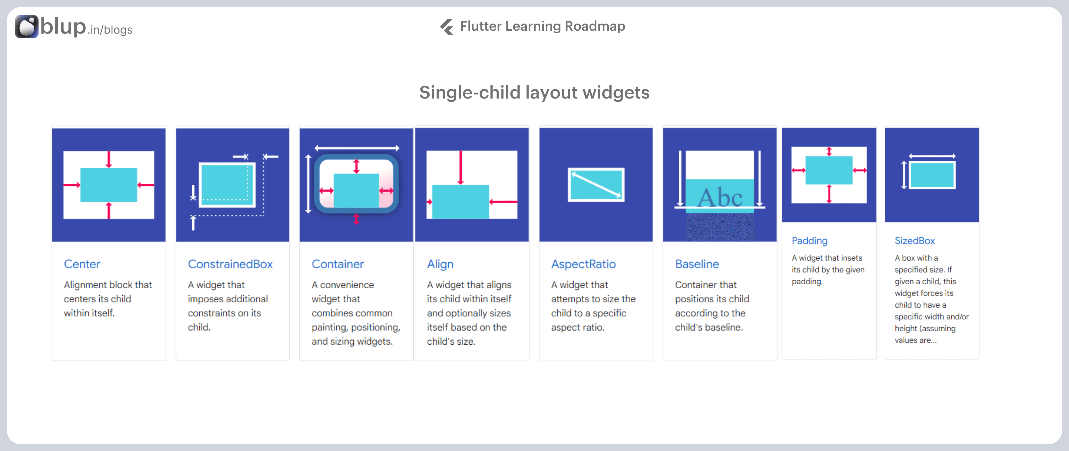
Flutter provides a variety of single-child layout widgets, each serving distinct purposes in UI design. Some of the most essential ones include:
Padding: Used to arrange its child widget by providing padding.Align: Aligns its child widget within itself using the value of the alignment property.FittedBox: Scales the child widget and positions it according to the specified fit.AspectRatio: Attempts to size the child widget to the specified aspect ratio.ConstrainedBox,Baseline,FractionallySizedBox,IntrinsicHeight,IntrinsicWidth,LimitedBox,OffStage,OverflowBox,SizedBox,SizedOverflowBox,Transform,CustomSingleChildLayout: Each of these widgets offers unique layout functionalities for creating diverse UI designs.
import 'package:flutter/material.dart';
void main() {
runApp(MyApp());
}
class MyApp extends StatelessWidget {
@override
Widget build(BuildContext context) {
return MaterialApp(
home: Scaffold(
appBar: AppBar(
title: Text('Center Widget Example'),
),
body: Center(
child: Container(
width: 200,
height: 200,
color: Colors.blue,
child: Text(
'Centered Text',
style: TextStyle(
fontSize: 24,
color: Colors.white,
),
),
),
),
),
);
}
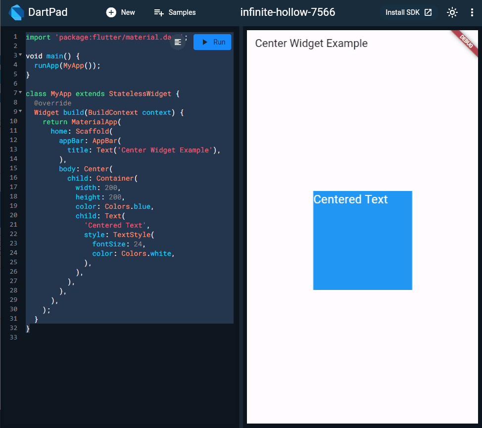
}In this example, we create a simple Flutter app with a single child widget: the Center widget. The Center widget contains a Container widget as its child, and the Container widget displays a blue-colored box with text centered within it. The Center widget ensures that the Container widget is perfectly centered both vertically and horizontally on the screen.
Output:
Multi-child layout widgets
In the realm of Flutter development, the category of multiple child widgets unlocks a world of possibilities for crafting sophisticated user interfaces. These widgets allow developers to arrange more than one child widget, each with its unique layout, paving the way for complex and dynamic UI designs. Let's explore some frequently used multiple-child widgets and delve into an advanced layout application.
Key Multiple Child Widgets:
Row Widget: Allows developers to arrange their children in a horizontal manner, making it ideal for creating horizontal sequences of UI elements.
Column Widget: Enables developers to arrange their children in a vertical manner, stacking them one below the other. This widget is perfect for vertical sequences of UI elements.
ListView Widget: Facilitates the arrangement of its children as a scrollable list, making it suitable for displaying large sets of data in a vertical scrollable layout.
GridView Widget: Provides developers with the ability to arrange their children in a grid layout, resembling a gallery. It's commonly used for showcasing images or items in an organized manner.
Expanded Widget: Used to make the children of Row and Column widgets occupy the maximum possible area within their respective parent widgets. It ensures a balanced and visually pleasing layout by distributing available space evenly among its children.
Other Notable Widgets: Flutter offers a variety of other multiple-child widgets to cater to specialized layout needs. These include the Table widget for creating table-based layouts, the Flow widget for flow-based layouts, and the Stack widget for stack-based layouts.
Creating an Advanced Layout Application:
In the upcoming section, we'll embark on an exploration of advanced layout techniques by building a complex user interface for a product listing with custom design. This application will leverage a combination of both single and multiple child layout widgets to achieve a sophisticated and visually appealing design.
Step-by-Step Guide:
Create a new Flutter application in Android Studio named
product_layout_app.Replace the code
main.dartwith the provided advanced layout code.
Stay tuned as we guide you through the intricacies of creating a compelling product listing UI, showcasing the versatility and power of multiple child widgets in Flutter.
The "Building Blocks of Layout Design" refers to the fundamental components and processes involved in structuring and organizing user interface (UI) elements within a Flutter application. These building blocks serve as the foundation for creating visually appealing, functional, and responsive UI layouts.
In the context of Flutter, the building blocks of layout design typically include:
Selecting a Layout Widget: Choosing an appropriate layout widget from Flutter's extensive library, such as
Container,Row,Column,Stack,ListView,GridView,Expanded, orFlexible, based on the specific design requirements and UI layout goals.Creating Visible Widgets: Designing and customizing the visual appearance of individual UI elements, such as buttons, text fields, images, and other widgets, to match the overall design aesthetics and user experience (UX) goals of the application.
Adding Visible Widgets to Layout Widgets: Incorporating the visible widgets into the selected layout widgets to define their positioning, sizing, and arrangement within the UI layout. This step involves nesting widgets within one another and configuring layout properties to achieve the desired UI structure.
Adding Layout Widgets to the Page: Integrating the layout widgets containing visible widgets into the application's UI hierarchy, ensuring that they are rendered correctly on the screen and interact seamlessly with other UI components and functionalities.
Type of Layout Widgets
Layout widgets can be grouped into two distinct categories based on their child −
Single Child Widgets
Single-child widgets in Flutter represent a category of widgets that have only one widget as their child. These widgets possess special layout functionalities, making them versatile tools for crafting precise and high-quality UI elements within your app.
For instance, the Center widget is a classic example of a single-child widget that centers its child widget within its parent widget. On the other hand, the Container widget offers comprehensive flexibility, allowing developers to position their child widget at any desired location within it using various options like padding, decoration, and more.
Exploring Important Single-Child Widgets
Flutter provides a variety of single-child layout widgets, each serving distinct purposes in UI design. Some of the most essential ones include:
Padding: Used to arrange its child widget by providing padding.Align: Aligns its child widget within itself using the value of the alignment property.FittedBox: Scales the child widget and positions it according to the specified fit.AspectRatio: Attempts to size the child widget to the specified aspect ratio.ConstrainedBox,Baseline,FractionallySizedBox,IntrinsicHeight,IntrinsicWidth,LimitedBox,OffStage,OverflowBox,SizedBox,SizedOverflowBox,Transform,CustomSingleChildLayout: Each of these widgets offers unique layout functionalities for creating diverse UI designs.
import 'package:flutter/material.dart';

void main() {
  runApp(MyApp());
}

class MyApp extends StatelessWidget {
  @override
  Widget build(BuildContext context) {
    return MaterialApp(
      home: Scaffold(
        appBar: AppBar(
          title: Text('Center Widget Example'),
        ),
        body: Center(
          child: Container(
            width: 200,
            height: 200,
            color: Colors.blue,
            child: Text(
              'Centered Text',
              style: TextStyle(
                fontSize: 24,
                color: Colors.white,
              ),
            ),
          ),
        ),
      ),
    );
  }
}
In this example, we create a simple Flutter app with a single child widget: the Center widget. The Center widget contains a Container widget as its child, and the Container widget displays a blue-colored box with text centered within it. The Center widget ensures that the Container widget is perfectly centered both vertically and horizontally on the screen.
Output:
Multi-child layout widgets
In the realm of Flutter development, the category of multiple child widgets unlocks a world of possibilities for crafting sophisticated user interfaces. These widgets allow developers to arrange more than one child widget, each with its unique layout, paving the way for complex and dynamic UI designs. Let's explore some frequently used multiple-child widgets and delve into an advanced layout application.
Key Multiple Child Widgets:
Row Widget: Allows developers to arrange their children in a horizontal manner, making it ideal for creating horizontal sequences of UI elements.
Column Widget: Enables developers to arrange their children in a vertical manner, stacking them one below the other. This widget is perfect for vertical sequences of UI elements.
ListView Widget: Facilitates the arrangement of its children as a scrollable list, making it suitable for displaying large sets of data in a vertical scrollable layout.
GridView Widget: Provides developers with the ability to arrange their children in a grid layout, resembling a gallery. It's commonly used for showcasing images or items in an organized manner.
Expanded Widget: Used to make the children of Row and Column widgets occupy the maximum possible area within their respective parent widgets. It ensures a balanced and visually pleasing layout by distributing available space evenly among its children.
Other Notable Widgets: Flutter offers a variety of other multiple-child widgets to cater to specialized layout needs. These include the Table widget for creating table-based layouts, the Flow widget for flow-based layouts, and the Stack widget for stack-based layouts.
Creating an Advanced Layout Application:
In the upcoming section, we'll embark on an exploration of advanced layout techniques by building a complex user interface for a product listing with custom design. This application will leverage a combination of both single and multiple child layout widgets to achieve a sophisticated and visually appealing design.
Step-by-Step Guide:
Create a new Flutter application in Android Studio named
product_layout_app.Replace the code
main.dartwith the provided advanced layout code.
Stay tuned as we guide you through the intricacies of creating a compelling product listing UI, showcasing the versatility and power of multiple child widgets in Flutter.
Exploring Each Layout Widget
Exploring Each Layout Widget
Exploring Each Layout Widget
Exploring Each Layout Widget
Now that we've covered the fundamentals of layout design in Flutter, it's time to dive deeper into each layout widget. In this section, we'll explore the characteristics, usage, and best practices for implementing the following layout widgets:
1. Container
The Container widget is one of the most versatile layout widgets in Flutter. It allows you to customize the visual appearance of its child widget using properties such as color, padding, margin, borders, and more. We'll delve into various use cases and advanced techniques for leveraging the Container widget in your UI designs.
2. Row and Column
Row and Column widgets are essential for arranging widgets horizontally and vertically, respectively. We'll explore how to use these widgets effectively to create flexible and responsive layouts, along with tips for handling alignment, spacing, and nested layouts.
3. Stack
The Stack widget enables you to overlay multiple widgets on top of each other, offering limitless possibilities for creative UI designs. We'll discuss techniques for positioning widgets within a stack, managing layering order, and implementing common UI patterns such as overlays and hero animations.
4. ListView and GridView
ListView and GridView widgets are essential for displaying scrollable lists and grids of widgets, making them ideal for building dynamic and data-driven interfaces. We'll cover various strategies for optimizing performance, handling large datasets, and customizing the layout and behavior of these widgets.
5. Expanded and Flexible
The Expanded and Flexible widgets play a crucial role in creating flexible and responsive layouts, especially within Row and Column widgets. We'll explore how to use these widgets to distribute available space efficiently and accommodate dynamic content sizes.
Material apps
For a Material app, you can use a Scaffold widget; it provides a default banner, and background color, and has API for adding drawers, snack bars, and bottom sheets. Then you can add the Center widget directly to the body property for the home page.
Cupertino apps
To create a Cupertino app, use CupertinoApp and CupertinoPageScaffold widgets.
Unlike Material, it doesn’t provide a default banner or background color. You need to set these yourself.
To set default colors, pass in a configured
CupertinoThemeDatato your app’sthemeproperty.To add an iOS-styled navigation bar to the top of your app, add a
CupertinoNavigationBarwidget to thenavigationBarproperty of your scaffold. You can use the colors thatCupertinoColorsprovides to configure your widgets to match iOS design.To lay out the body of your app, set the
childproperty of your scaffold with the desired widget as its value, likeCenterorColumn.
Non-Material apps
For a non-Material app, you can add the Center widget to the app’s build() method:
lib/main.dart (MyApp)
class MyApp extends StatelessWidget {
  const MyApp({super.key});

  @override
  Widget build(BuildContext context) {
    return Container(
      decoration: const BoxDecoration(color: Colors.white),
      child: const Center(
        child: Text(
          'Hello World',
          textDirection: TextDirection.ltr,
          style: TextStyle(
            fontSize: 32,
            color: Colors.black87,
          ),
        ),
      ),
    );
  }
}
By default, a non-Material app doesn’t include an AppBar, title, or background color. If you want these features in a non-Material app, you have to build them yourself. This app changes the background color to white and the text to dark grey to mimic a Material app.
Frequently Asked Questions (FAQs)
Frequently Asked Questions (FAQs)
Frequently Asked Questions (FAQs)
Frequently Asked Questions (FAQs)
What is the difference between the Single-Child Layout Widget & Multi-Child Layout Widget in Flutter? Ask Question
Single-Child Layout Widgets are the ones that will accept only one widget as their child.
Such as: Container(), Center(), Expanded(), Align(), SizedBox() etc.
Multi-Child Layout Widgets are the ones that will accept more than one widget as their child. Such as: Column(), Row(), Stack(), GridView(), ListView(), Table(), etc.
In very simple terms Whenever you see or use a widget with a child property, That widget is called Single-Child Layout.
Container(child: Text());
Center(child: Text());
Expanded(child: Text());
Align(child: Text());
SizedBox(child: Text());
Whenever you see or use a widget with a children property, That widget is called Multi-Child Layout.
Column(children: [Text(), Text(), Text(), Text()]);
Row(children: [Text(), Text(), Text(), Text()]);
Stack(children: [Text(), Text(), Text(), Text()]);
GridView(children: [GridTile(), GridTile(), GridTile(), GridTile()]);
ListView(children: [ListTile(), ListTile(), ListTile(), ListTile()]);
Table(children: [TableRow(), TableRow(), TableRow(), TableRow()]);
Single-Child Layout Widget is used as a Wrapper for other widgets for changing their positions, width, height, adding space, margin, and aligning content, etc.
A multi-child Layout Widget is used for creating a list of widgets in the horizontal or vertical direction, also for stacking widgets one over another, Arranging data as well as widgets in a table structure, etc.
How to show/hide widgets programmatically in Flutter? Ask Question
In Flutter, showing or hiding widgets dynamically based on certain conditions is a common requirement in app development. In this guide, we'll explore various techniques to achieve this programmatically.
Methods for Showing/ Hiding Widgets
Using the Visibility Widget
Explanation of the Visibility widget and its properties.
Demonstration of how to conditionally show/hide widgets using the Visibility widget.
Using the Opacity Widget
Overview of the Opacity widget and its purpose.
Example of how to fade in/out widgets based on specific conditions using the Opacity widget.
Using the Offstage Widget
Introduction to the Offstage widget and its functionality.
Illustration of how to completely remove widgets from the layout without affecting their state using the Offstage widget.
Using AnimatedOpacity for Animated Transitions
Explanation of the AnimatedOpacity widget and its capabilities.
Guide on how to create smooth animated transitions when showing/hiding widgets using AnimatedOpacity.
There are lots of ways to do this depending on your use case. Here are a few options:
You can expose the created object as a public member of your
State. Then use thecurrentStateproperty of aGlobalKeyin oneStateto get a reference to the otherState. Now you can access the created object via the public member. (Note: This pattern limits the testability and encapsulation of yourState, so use it sparingly.)Both widgets can have an ancestor widget that extends
InheritedWidgetthat they use to look up the created object.Both widgets can be passed a model argument in their constructor, such as a
ValueNotifier. They can use this object to read and write the value.
If you go into more detail on your use case we can help you pick a pattern that makes sense.
How can I layout widgets based on the size of the parent? Ask Question
You will want to use the LayoutBuilder widget which will build at layout time and provides the parent widget's constraints.
The
LayoutBuildertakes in abuild()function which has the the standard BuildContext along with the BoxConstraints as parameters that can be used to help dynamically render widgets based on size.Let's build a simple example of a widget that renders "LARGE" if the parent width is greater than 200px and "SMALL" if the parent width is less or equal to that.
var container = Container(
    // Toggling width from 100 to 300 will change what is rendered
    // in the child container
    width: 100.0,
    // width: 300.0
    child: LayoutBuilder(
        builder: (BuildContext context, BoxConstraints constraints) {
            return Text(constraints.maxWidth > 200 ? 'BIG' : 'SMALL');
        }
    ),
);
What is the difference between Scaffold and Container in Flutter? Ask Question
Scaffoldandcontainerserve different purposes for layout and design.Scaffold
Implements the basic material design visual layout structure.
This class provides APIs for showing drawers, snack bars, and bottom sheets.
Link - Scaffold
Container
A convenience widget that combines common painting, positioning, and sizing widgets.
It contains different widgets into one widget over which you can give padding, size, position, etc.
Link -Container
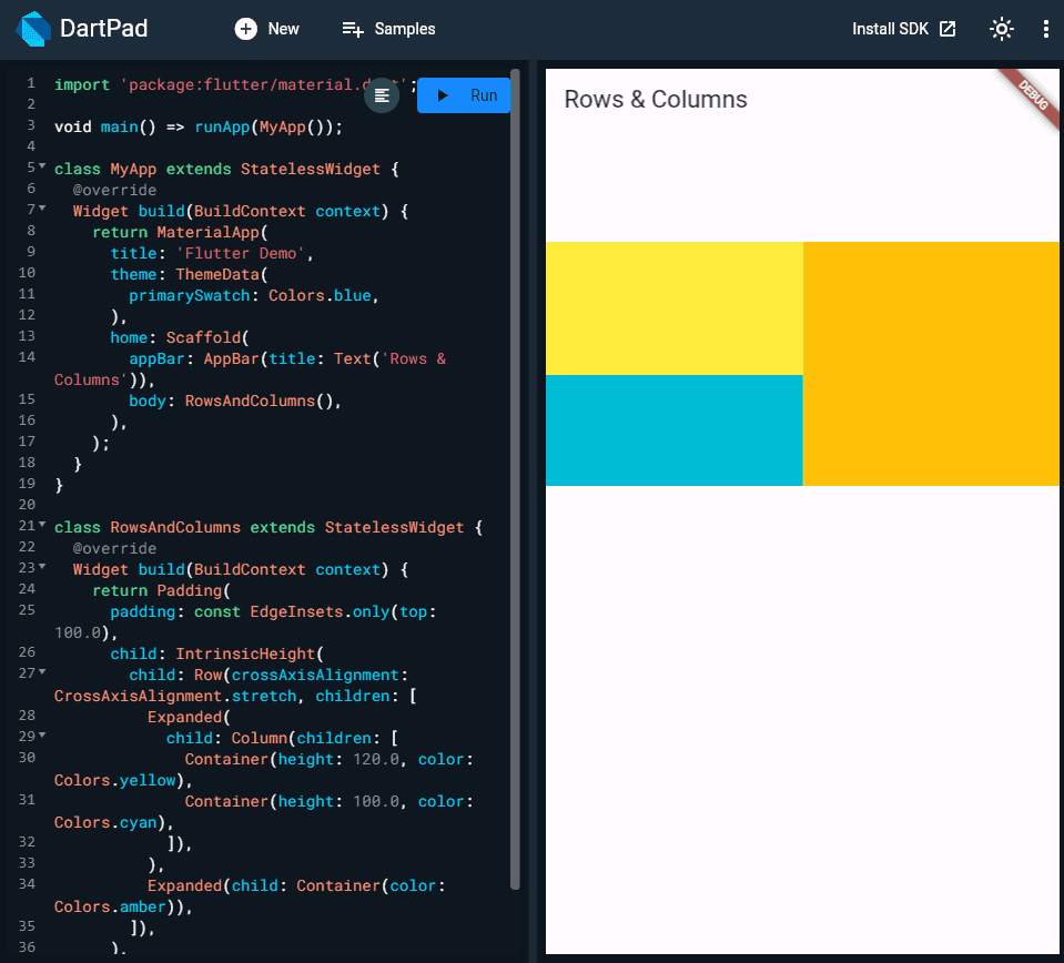
Flutter Layout Row / Column - share width, expand height. Ask Question
a. Can Flutter handle dynamic height adjustments for widgets based on content size, especially in a quadrant layout scenario?b. Are there any Flutter packages or libraries that provide pre-built solutions for dynamically adjusting widget heights in complex layouts like a quadrant layout?

Have a look at
IntrinsicHeight; wrapping the root Row should provide the effect you're looking for:
What is the difference between the Single-Child Layout Widget & Multi-Child Layout Widget in Flutter? Ask Question
Single-Child Layout Widgets are the ones that will accept only one widget as their child.
Such as: Container(), Center(), Expanded(), Align(), SizedBox() etc.
Multi-Child Layout Widgets are the ones that will accept more than one widget as their child. Such as: Column(), Row(), Stack(), GridView(), ListView(), Table(), etc.
In very simple terms Whenever you see or use a widget with a child property, That widget is called Single-Child Layout.
Container(child: Text());
Center(child: Text());
Expanded(child: Text());
Align(child: Text());
SizedBox(child: Text());
Whenever you see or use a widget with a children property, That widget is called Multi-Child Layout.
Column(children: [Text(), Text(), Text(), Text()]);
Row(children: [Text(), Text(), Text(), Text()]);
Stack(children: [Text(), Text(), Text(), Text()]);
GridView(children: [GridTile(), GridTile(), GridTile(), GridTile()]);
ListView(children: [ListTile(), ListTile(), ListTile(), ListTile()]);
Table(children: [TableRow(), TableRow(), TableRow(), TableRow()]);
Single-Child Layout Widget is used as a Wrapper for other widgets for changing their positions, width, height, adding space, margin, and aligning content, etc.
A multi-child Layout Widget is used for creating a list of widgets in the horizontal or vertical direction, also for stacking widgets one over another, Arranging data as well as widgets in a table structure, etc.
How to show/hide widgets programmatically in Flutter? Ask Question
In Flutter, showing or hiding widgets dynamically based on certain conditions is a common requirement in app development. In this guide, we'll explore various techniques to achieve this programmatically.
Methods for Showing/ Hiding Widgets
Using the Visibility Widget
Explanation of the Visibility widget and its properties.
Demonstration of how to conditionally show/hide widgets using the Visibility widget.
Using the Opacity Widget
Overview of the Opacity widget and its purpose.
Example of how to fade in/out widgets based on specific conditions using the Opacity widget.
Using the Offstage Widget
Introduction to the Offstage widget and its functionality.
Illustration of how to completely remove widgets from the layout without affecting their state using the Offstage widget.
Using AnimatedOpacity for Animated Transitions
Explanation of the AnimatedOpacity widget and its capabilities.
Guide on how to create smooth animated transitions when showing/hiding widgets using AnimatedOpacity.
There are lots of ways to do this depending on your use case. Here are a few options:
You can expose the created object as a public member of your
State. Then use thecurrentStateproperty of aGlobalKeyin oneStateto get a reference to the otherState. Now you can access the created object via the public member. (Note: This pattern limits the testability and encapsulation of yourState, so use it sparingly.)Both widgets can have an ancestor widget that extends
InheritedWidgetthat they use to look up the created object.Both widgets can be passed a model argument in their constructor, such as a
ValueNotifier. They can use this object to read and write the value.
If you go into more detail on your use case we can help you pick a pattern that makes sense.
How can I layout widgets based on the size of the parent? Ask Question
You will want to use the LayoutBuilder widget which will build at layout time and provides the parent widget's constraints.
The
LayoutBuildertakes in abuild()function which has the the standard BuildContext along with the BoxConstraints as parameters that can be used to help dynamically render widgets based on size.Let's build a simple example of a widget that renders "LARGE" if the parent width is greater than 200px and "SMALL" if the parent width is less or equal to that.
var container = Container(
    // Toggling width from 100 to 300 will change what is rendered
    // in the child container
    width: 100.0,
    // width: 300.0
    child: LayoutBuilder(
        builder: (BuildContext context, BoxConstraints constraints) {
            return Text(constraints.maxWidth > 200 ? 'BIG' : 'SMALL');
        }
    ),
);
What is the difference between Scaffold and Container in Flutter? Ask Question
Scaffoldandcontainerserve different purposes for layout and design.Scaffold
Implements the basic material design visual layout structure.
This class provides APIs for showing drawers, snack bars, and bottom sheets.
Link - Scaffold
Container
A convenience widget that combines common painting, positioning, and sizing widgets.
It contains different widgets into one widget over which you can give padding, size, position, etc.
Link -Container
Flutter Layout Row / Column - share width, expand height. Ask Question
a. Can Flutter handle dynamic height adjustments for widgets based on content size, especially in a quadrant layout scenario?b. Are there any Flutter packages or libraries that provide pre-built solutions for dynamically adjusting widget heights in complex layouts like a quadrant layout?
Have a look at
IntrinsicHeight; wrapping the root Row should provide the effect you're looking for:
Conclusion
Conclusion
Conclusion
Conclusion
In the dynamic world of Flutter development, mastering the art of crafting a responsive user interface (UI) is a pivotal skill for ensuring the success of your app. Throughout this guide, we've explored the intricate landscape of layout widgets, understanding their significance and how they shape the visual appeal and functionality of your app's UI.
Empowered to Craft a Responsive UI
Armed with the knowledge gained from our journey through layout widgets, you now possess the tools to create a responsive and visually stunning UI in Flutter. The key lies in selecting the right layout widget that aligns seamlessly with your app's design goals and user experience objectives.
Dive In and Experiment
The world of Flutter is a playground for creativity and innovation. Dive into your project, experiment with different layout widgets, and witness your app come to life with an intuitive and engaging user experience. Flutter's flexibility allows you to adapt your UI across various devices, ensuring a consistent and delightful interaction for every user.
Your App, Your Masterpiece
As you navigate the diverse range of layout widgets and their functionalities, remember that each choice contributes to the overall personality of your app. Whether it's a sleek and minimalistic design or a vibrant and interactive interface, the power to shape your app's identity lies in your hands.
Continual Learning and Growth
The field of Flutter development is ever-evolving, and there's always more to explore. Continue your learning journey, stay updated with the latest features and practices, and implement them to elevate your UI design skills. Flutter's active community and extensive documentation are valuable resources for ongoing growth.
Crafting Intuitive and Engaging User Experiences
In conclusion, the ability to craft a responsive UI in Flutter is a valuable skill that enhances the user experience and sets your app apart. By choosing the right layout widget and combining it with your creativity, you have the potential to create apps that not only function seamlessly but also leave a lasting impact on users.
So, go ahead, embrace the world of Flutter, and craft UIs that resonate with your audience—your app, your masterpiece!
Table of content


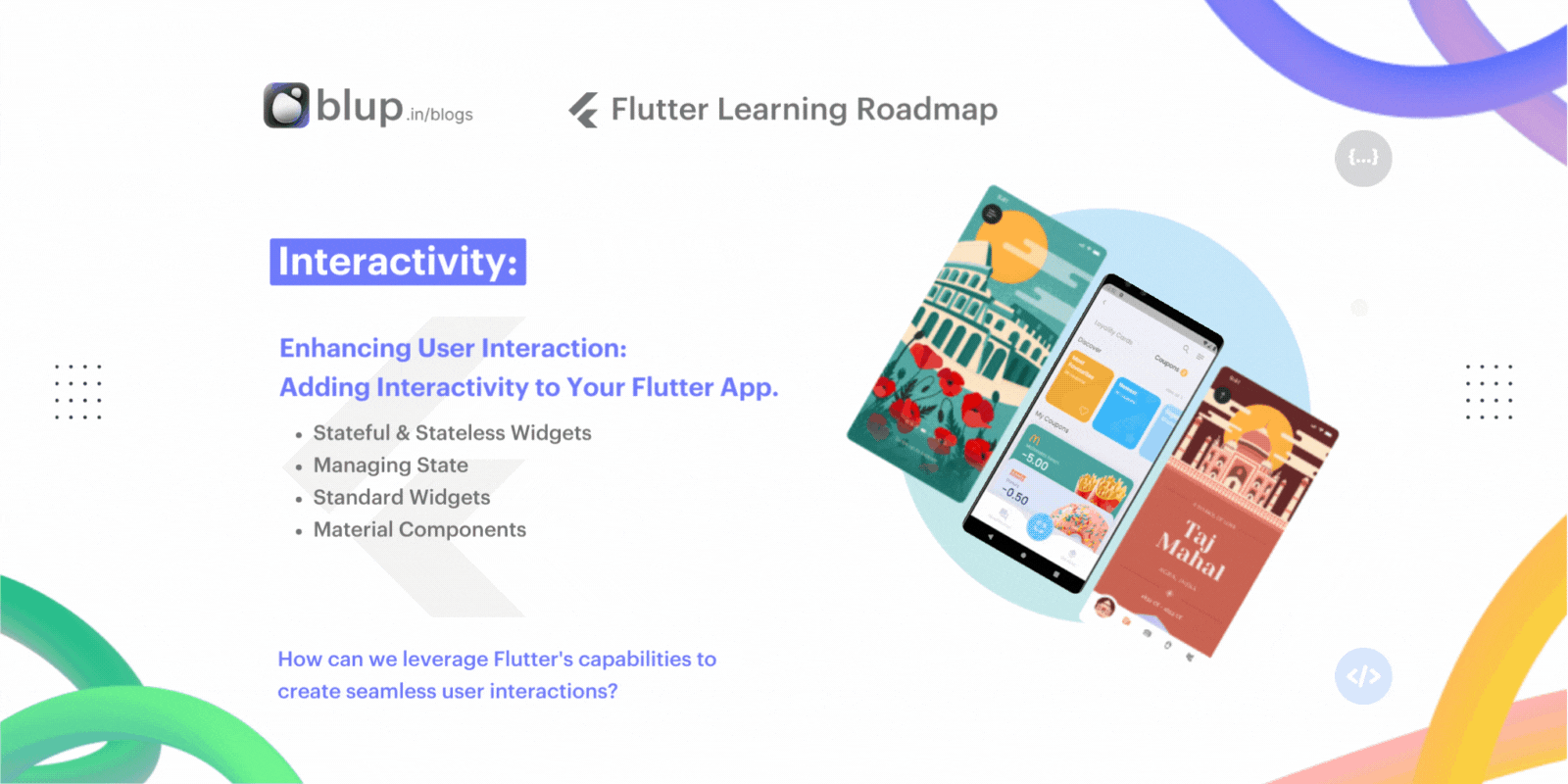
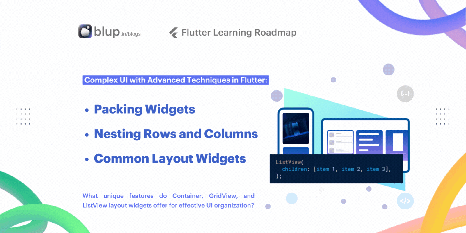


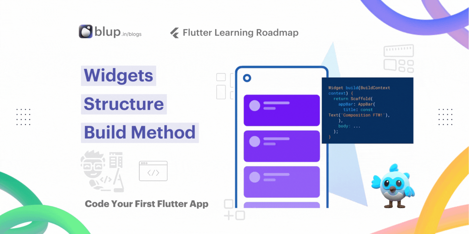


© 2021-25 Blupx Private Limited.
All rights reserved.
© 2021-25 Blupx Private Limited.
All rights reserved.
© 2021-25 Blupx Private Limited.
All rights reserved.