

Build Forms with Validation in Flutter - Text Fields, Validation, Focus Management.

Introduction
Welcome to the ultimate guide on building forms with validation in Flutter! In this blog, we'll delve into the intricacies of creating interactive and user-friendly forms using Flutter's powerful features. Before we dive in, let's explore some fascinating facts about Flutter:
Flutter is an open-source UI software development kit created by Google.
It allows developers to build natively compiled applications for mobile, web, and desktop from a single codebase.
Flutter provides a rich set of widgets and tools for creating beautiful and responsive user interfaces.
Now, let's address some commonly asked questions about building forms with validation in Flutter:
How can I create text fields in Flutter and validate user input?
What techniques can I use to manage focus in text fields?
Is there a way to ensure data integrity and validate forms before submission?
This blog is part of Blup's Flutter Learning Roadmap Series, focusing on mastering various aspects of Flutter development. Our previous topic covered gestures in Flutter, exploring how to incorporate touch interactions into your Flutter apps.
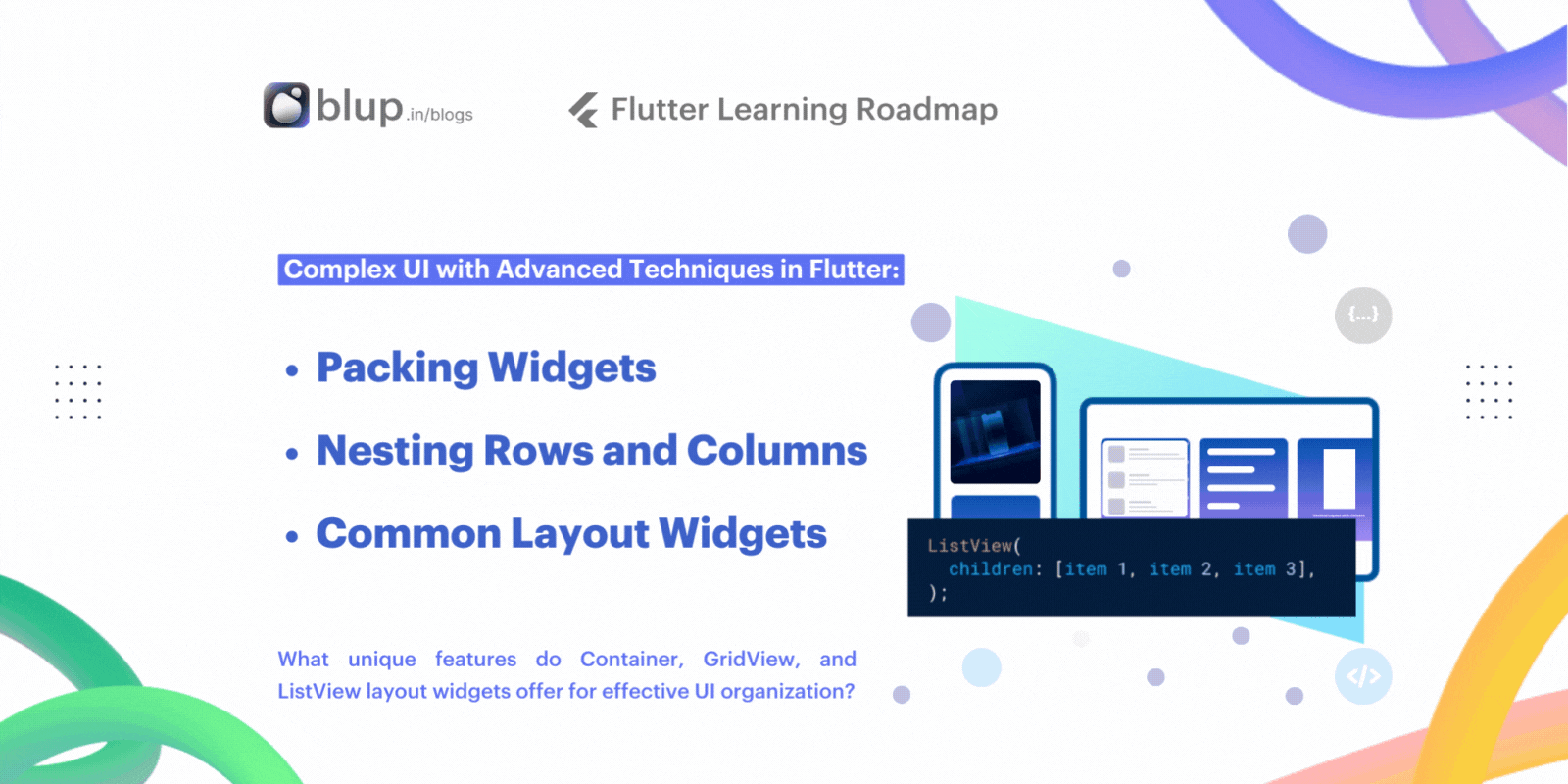
Creating and Styling Text Fields
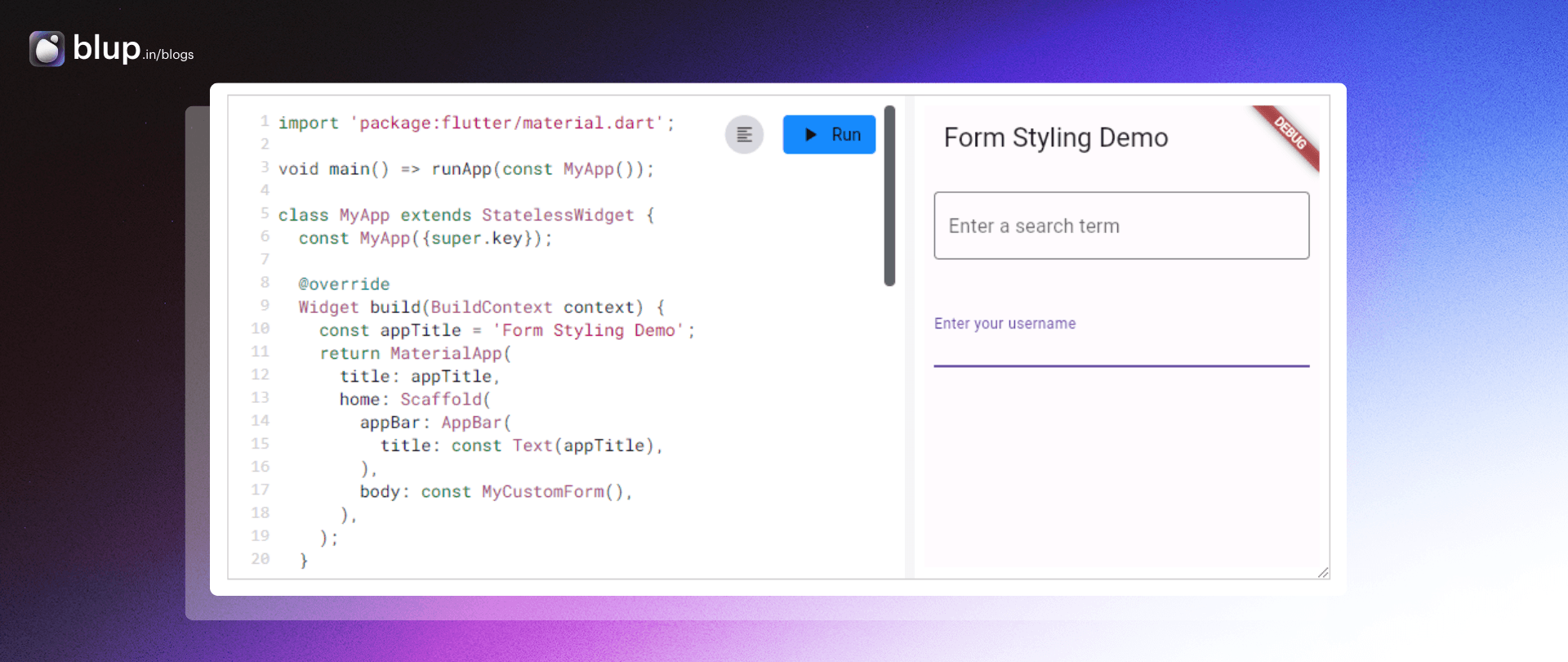
Empower your Flutter app with text fields for seamless user interaction. Text fields serve various purposes like form input, messaging, and search functionalities.
Let's explore two essential text field widgets provided by Flutter: TextField and TextFormField.
TextField
TextField is the most commonly used text input widget.
TextField is the go-to choice for text input. By default, it features an underlined decoration. Customize it further by adding labels, icons, hint text, and error messages through the InputDecoration property. For a clean look, you can remove the decoration entirely.
To retrieve the value when it changes, see the Handle changes to a text field recipe.
TextFormField
TextFormField extends TextField and seamlessly integrates with forms. It offers advanced features like validation and coordination with other FormField widgets.
Experience the power of text fields in your Flutter app, enhancing user engagement and interaction.
Interactive example
Retrieving Text Field Values

Text fields in Flutter serve as gateways for user input, facilitating various interactions within your app. In this guide, we'll walk through the process of retrieving user-entered text from text fields in a Flutter app, step by step.
Create a
TextEditingController.Supply the
TextEditingControllerto aTextField.Display the current value of the text field.
Create a TextEditingController
To retrieve text entered by the user, start by creating a TextEditingController. This controller acts as a mediator between the text field and your app, allowing you to access the entered text.
Supply the TextEditingController to a TextField
Now that you have a TextEditingController, wire it up to a text field using the controller property:
Display the current value of the text field
Retrieve the user-entered text using the text() method provided by TextEditingController. You can then utilize this data as needed within your app.
The following code displays an alert dialog with the current value of the text field when the user taps a floating action button.
Interactive example
Handling Changes in Text Fields

Want to update your app dynamically as users type in text fields?
Discover two easy methods in Flutter:
1. Utilize the onChanged() callback to a TextField or a TextFormField.
2. Leverage TextEditingController for seamless text updates.
Supply an onChanged() callback to a TextField or a TextFormField
The easiest way to track text changes in Flutter is by using the onChanged() callback with a TextField or TextFormField. This example demonstrates printing the current value and length of the text field to the console whenever the text changes.
Remember to handle characters appropriately, especially when dealing with user input, to ensure accurate character counting.
Use a TextEditingController
A more powerful, but more elaborate approach, is to supply a TextEditingController as the controller property of the TextField or a TextFormField.
To be notified when the text changes, listen to the controller using the addListener() method using the following steps:
Create a
TextEditingController.Connect the
TextEditingControllerto a text field.Create a function to print the latest value.
Listen to the controller for changes.
Create a TextEditingController
Create a TextEditingController:
Connect the TextEditingController to a text field
You need a function to run every time the text changes. Create a method in the _MyCustomFormState class that prints out the current value of the text field.
Listen to the controller for changes
Finally, listen to the TextEditingController and call the _printLatestValue() method when the text changes. Use the addListener() method for this purpose.
Begin listening for changes when the _MyCustomFormState class is initialized, and stop listening when the _MyCustomFormState is disposed.
Interactive example
Focus and text fields

When developing forms in Flutter, managing focus is essential for providing a seamless user experience. Whether it's directing focus to a text field upon screen navigation or in response to user interaction, understanding how to manage focus is crucial.
For instance, imagine a search screen where users should start typing immediately upon arrival. By setting focus to the search text field automatically, you streamline the user experience.
In this recipe, discover how to manage focus effectively in two scenarios: automatically focusing on a text field when it's visible and programmatically focusing on a text field when a button is tapped.
Focus on a text field as soon as it's visible
To automatically set focus to a text field when it becomes visible, utilize the autofocus property:
Focus a text field when a button is tapped
In this example, give focus to a text field after the user presses a button using the following steps:
Create a
FocusNode.Pass the
FocusNodeto aTextField.Give focus to the
TextFieldwhen a button is tapped.
Create a
FocusNode
Define a FocusNode to identify the target TextField in Flutter's focus tree.
Since focus nodes are long-lived objects, manage the lifecycle using a State object. Use the following instructions to create a FocusNode instance inside the initState() method of a State class, and clean it up in the dispose() method:
Pass the FocusNode to a TextField
Within the build() method, associate the FocusNode with the desired TextField:
Give focus to the TextField when a button is tapped
Upon pressing a button, use the requestFocus() method to direct focus to the specified text field:
By implementing these techniques, you can effectively manage focus in your Flutter applications for enhanced user interaction
Interactive example
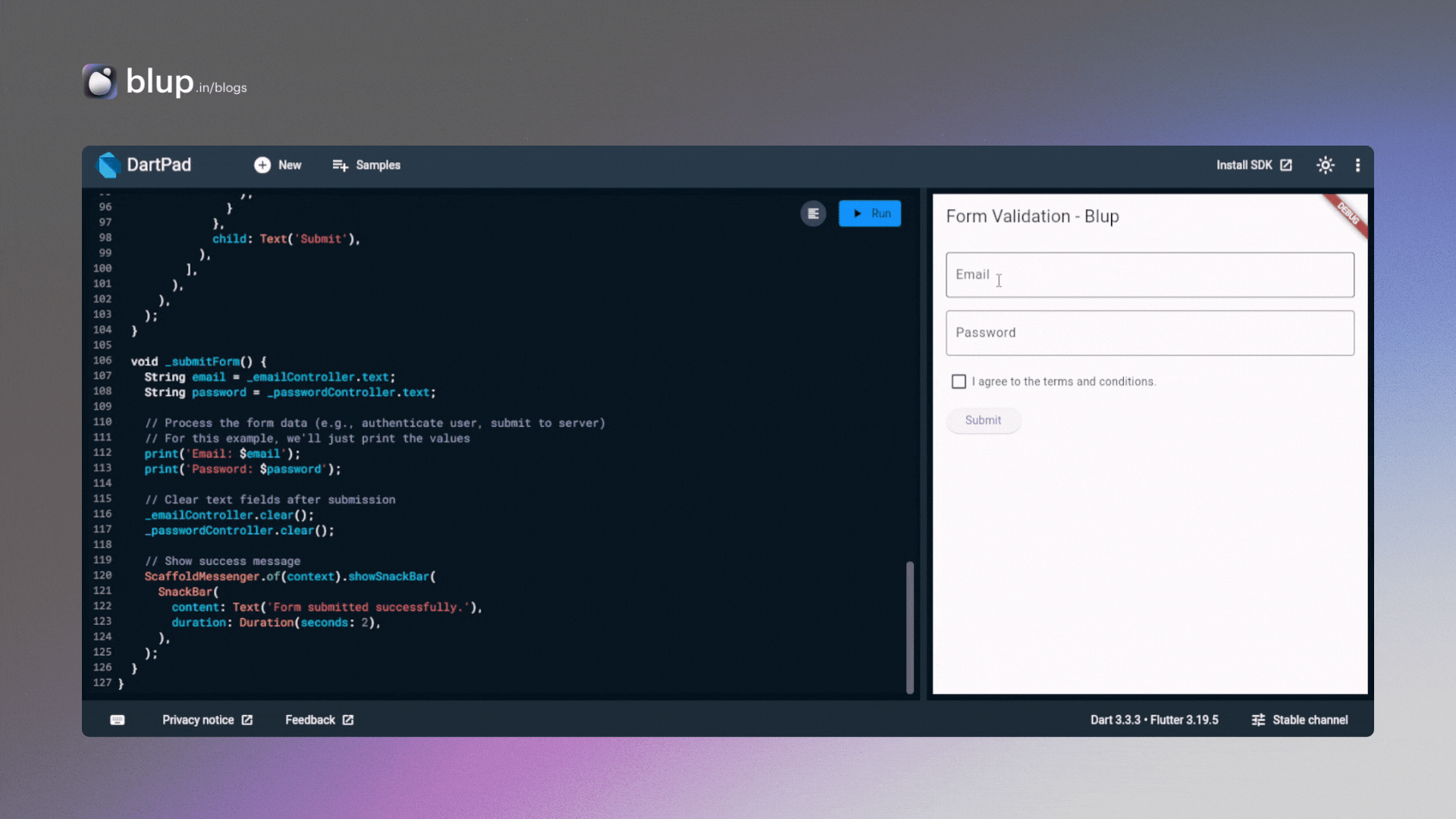
Building Forms with Validation
In the context of app development, gathering accurate user input is crucial. Whether it's for logging in or signing up, ensuring the data entered meets certain criteria is essential for app security and usability. Let's explore how to implement validation in a form with a single text field:
Create a
Formwith aGlobalKe: Establish a form with a unique identifier to manage its state and perform validation.Add Validation Logic to the
TextFormField: Implement validation logic within the text field to verify the entered data meets specific requirements.Provide Feedback to the User: Display informative error messages to guide users when they input invalid data, ensuring a seamless and user-friendly experience.
1. Create a Form with a GlobalKey
Create a Form with a GlobalKey to organize and validate form fields efficiently. Using a StatefulWidget ensures optimal resource usage by storing a single GlobalKey<FormState>() once.
If you made this a StatelessWidget, you'd need to store this key somewhere. As it is resource-expensive, you wouldn't want to generate a new GlobalKey each time you run the build method.
2. Add a TextFormField with validation logic
Let's integrate text input fields into our form using TextFormField. This widget is essential for user interaction and validation.
We'll ensure the input's validity by adding a validator() function to the TextFormField. If the input doesn't meet the required criteria, the validator function returns a String containing an error message. Otherwise, it returns null.
In this example, we'll validate if the TextFormField is empty. If so, we'll prompt the user to fill in the field.
3. Create a button to validate and submit the form
Finally, we'll include a button to trigger form validation and submission. Upon pressing the button, the validator function executes, validating the input. If the input is valid, the form can be submitted for further processing.
How does this work?
To validate the form, we utilize the _formKey created earlier. With this key, we access the FormState using _formKey.currentState(). The FormState class provides the validate() method, which triggers the validation process for each field in the form.
If the validation succeeds for all fields, validate() returns true, indicating that the form is valid. However, if any field fails validation, the method rebuilds the form, displaying error messages accordingly, and returns false.
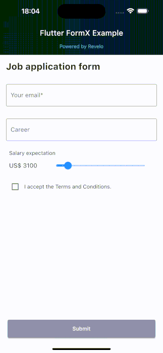
Flutter FormX Package -
Flutter FormX is an extensible package to make it easy to build, react to and validate forms using MobX and Bloc.
Interactive example
Demonstrates building a form with validation in Flutter.
Includes input fields for email and password.
Features a checkbox for accepting terms and conditions.
Form validation ensures both fields are filled and terms are accepted before submission.
Upon successful submission, the form data is processed and a success message is displayed.
Download Our Flutter-based App Builder "Blup"
Start Building with Blup - Blup's Role in App Development
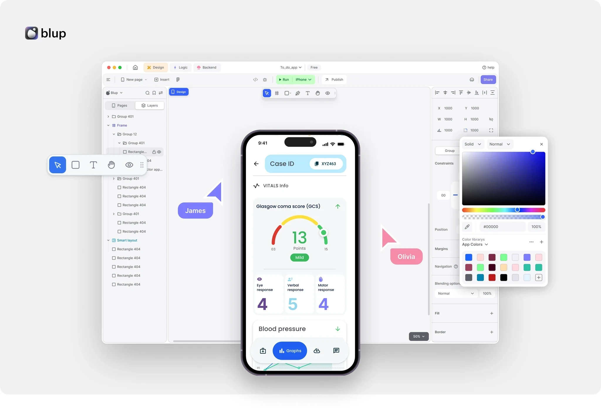
Blup Tool: With its user-friendly interface and robust capabilities, Blup is an ideal solution for shipping industry app development.
Ease of Use: Blup's intuitive interface enables even novice users to create functional and visually appealing apps effortlessly.
Flexibility with Flutter: Built on the Flutter framework, Blup offers unmatched flexibility, allowing developers to create apps that run seamlessly on iOS and Android with a single codebase.
Rapid Prototyping: Blup facilitates rapid prototyping, enabling businesses to swiftly develop and test their app ideas in real-world environments. This is particularly beneficial in the dynamic shipping industry, where market needs evolve quickly.
Flutter Learning Resources
Are you ready to dive into the world of Flutter development? Whether you're a beginner looking to build your first app or an experienced developer aiming to enhance your skills, Blup has you covered with our comprehensive Flutter Learning Roadmap Series.
Previous Blogs: Flutter Learning Roadmaps Series
List previous blogs in the Flutter Learning Roadmaps Series, including "Mastering Gestures in Flutter: Taps, Drags, multi-touch gestures, Gesture Detector and More." for readers to reference and continue their learning.
Here's a list of reference links for the keywords and widgets used in the content:
Form, GlobalKey, TextFormField, FormState.
To learn how to retrieve these values, check out the Retrieve the value of a text field recipe.
Resources to Get Started
Blup Services
Ready to bring your app ideas to life? Partner with Blup Services today and experience the difference! Contact us now to schedule a consultation and start your app development journey on the right track.

Benefits of Choosing Blup Services:
Tailored Solutions: Get customized Flutter apps crafted to match your unique business needs and objectives.
Swift Development: Enjoy accelerated project timelines, ensuring timely delivery of top-quality applications.
Cost Savings: Maximize efficiency and reduce project expenses with our optimized development process. Unlock the full potential of your app development projects with Blup Services. Contact us today to get started!
Conclusion
Learn input & form essentials in Flutter. Explore Blup for seamless app dev.
Discover essential techniques in Flutter input and form management through our comprehensive guide. From creating and styling text fields to handling changes and managing focus, we've covered it all.
Dive deep into building forms with validation, ensuring seamless user interaction. Explore Blup for effortless app development, and access curated Flutter learning resources to enhance your skills further. Take your Flutter journey to new heights with our insightful blog series.


