

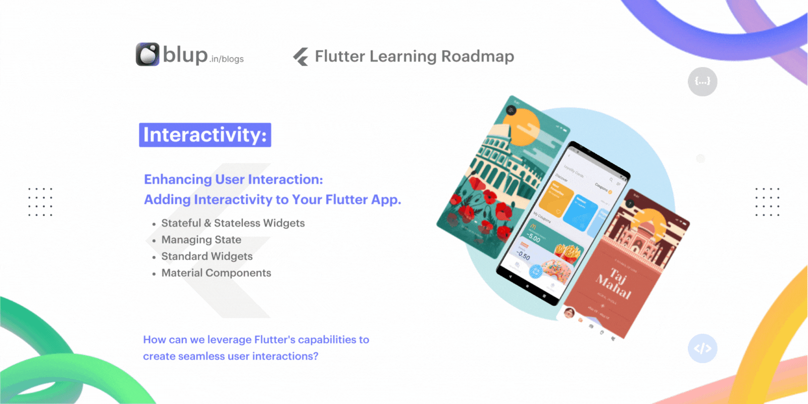
Enhancing User Interaction: Adding Interactivity to Your Flutter App.
Introduction:
In today's fast-paced digital world, user interaction is paramount to the success of any mobile application. As developers, our goal is not just to create static interfaces but to craft dynamic experiences that captivate and engage users at every touchpoint. Enter Flutter – Google's UI toolkit for building natively compiled applications across mobile, web, and desktop from a single codebase.
Welcome to the latest installment of our Flutter Learning Roadmap Series, where we dive deep into mastering interactivity in Flutter app development. In this blog, we'll explore how to elevate your Flutter apps by adding intuitive and responsive interactions that keep users coming back for more.
Key Questions to Consider:
How can we leverage Flutter's capabilities to create seamless user interactions?
What are the best practices for incorporating interactivity into Flutter apps?
How do interactive elements contribute to a more engaging user experience?
What tools and techniques can we utilize to enhance user engagement in our Flutter projects?
This blog post is part of our ongoing Flutter Learning Roadmap Series, designed to provide comprehensive insights into various aspects of Flutter app development. Join us as we unravel the secrets to creating captivating user experiences and unlocking the full potential of Flutter's interactive capabilities.
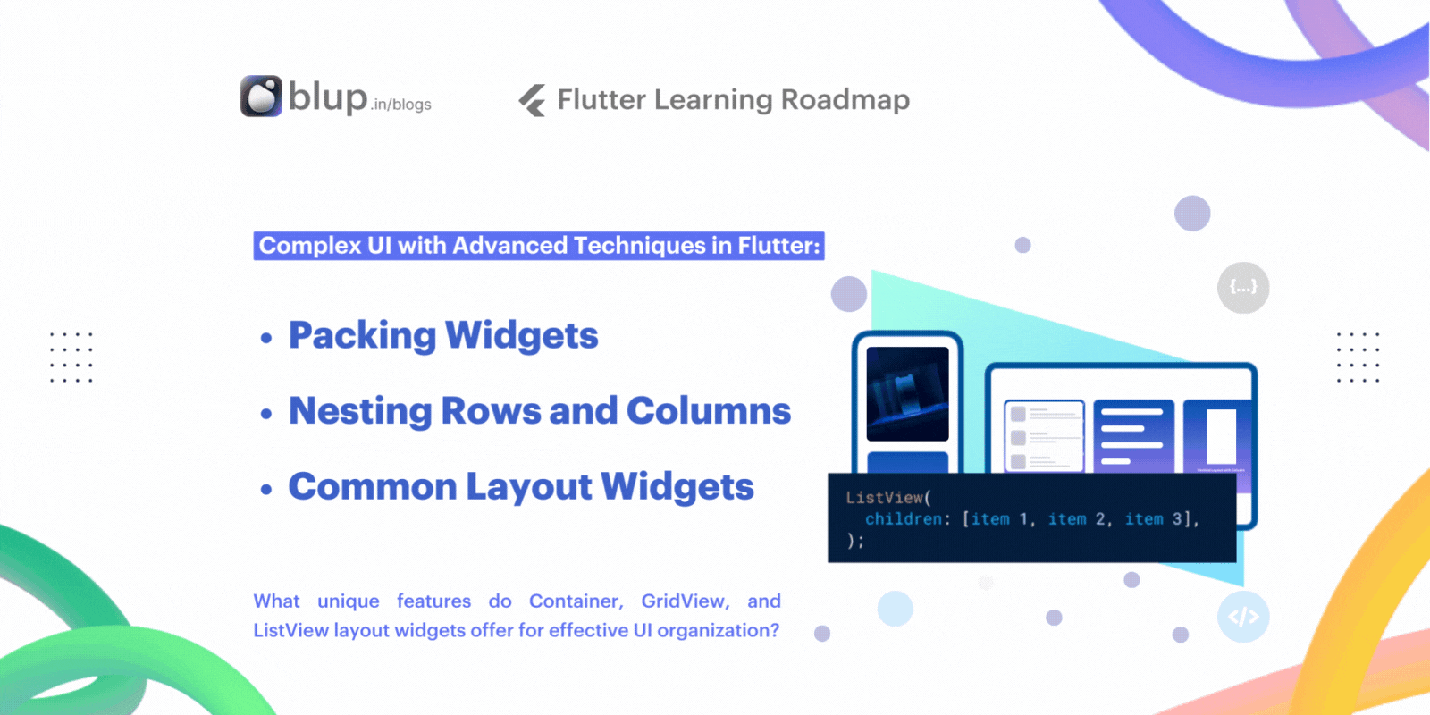
Stateful vs Stateless Widgets
In the realm of Flutter app development, mastering the dichotomy between stateful and stateless widgets is pivotal. These widgets, fundamental to crafting captivating user interfaces, hold distinct roles in enhancing interactivity and responsiveness.
Understanding Stateful and Stateless Widgets
At the heart of Flutter's UI architecture lies the concept of stateful and stateless widgets. But what delineates one from the other?
Stateless Widgets: Let's commence with the simpler counterpart. Stateless widgets maintain a perpetual state throughout their lifecycle. They remain impervious to external influences, steadfast in their appearance and behavior. Picture them as immutable entities within your UI repertoire. Examples of stateless widgets include Icons, IconButtons, and Text elements, steadfast in their form and function.
Stateful Widgets: Conversely, stateful widgets inject dynamism into your app's interface. These widgets possess the remarkable ability to adapt their appearance or behavior in response to various stimuli, be it user interactions or incoming data streams. They serve as the catalysts behind interactive components like checkboxes, sliders, InkWell, forms, and TextField. Unlike their stateless counterparts, stateful widgets harbor intrinsic flexibility, enabling them to evolve with the changing tides of user engagement.
Example:
Let's illustrate the dichotomy with a practical example—a to-do list application. Each item on the list warrants representation through widgets. Here's how you might integrate stateful and stateless widgets into this scenario:
Stateless Widget: Visualize the individual to-do items rendered through a stateless widget. Since these items maintain a static demeanor, impervious to external stimuli, a stateless widget serves as the ideal conduit. Its steadfast nature ensures uniformity across the interface, devoid of fluctuations induced by user interactions.
Stateful Widget: Now, let's infuse interactivity into the mix. Imagine augmenting each to-do item with a checkbox, empowering users to mark tasks as completed. Herein lies the domain of stateful widgets. The checkbox widget, imbued with the capacity to toggle between checked and unchecked states, necessitates a dynamic framework. As users interact with the checkbox, its state undergoes metamorphosis, a testament to the versatility of stateful widgets in facilitating user engagement.
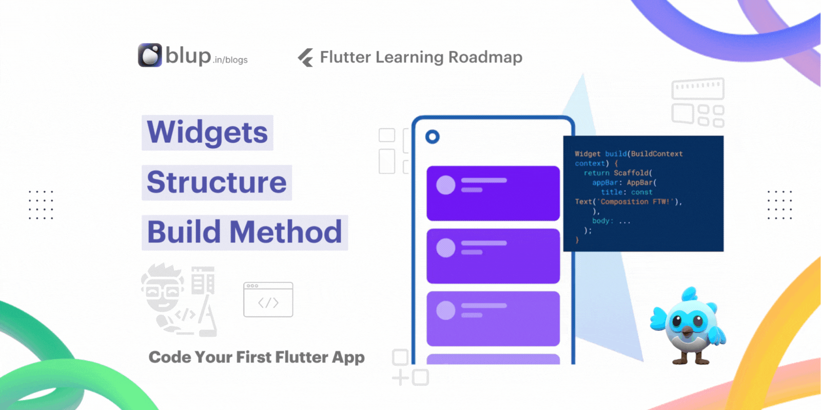
Creating a Stateful Widget
In the world of app development, interactivity reigns supreme. Users expect seamless experiences that respond to their touch, swipe, and every interaction in between. Flutter, with its robust framework, empowers developers to create apps that not only look great but also feel intuitive and engaging.
In this guide, we'll explore the process of enhancing user interaction by adding interactivity to your Flutter app. Specifically, we'll focus on creating stateful widgets, a crucial aspect of building dynamic and responsive user interfaces.
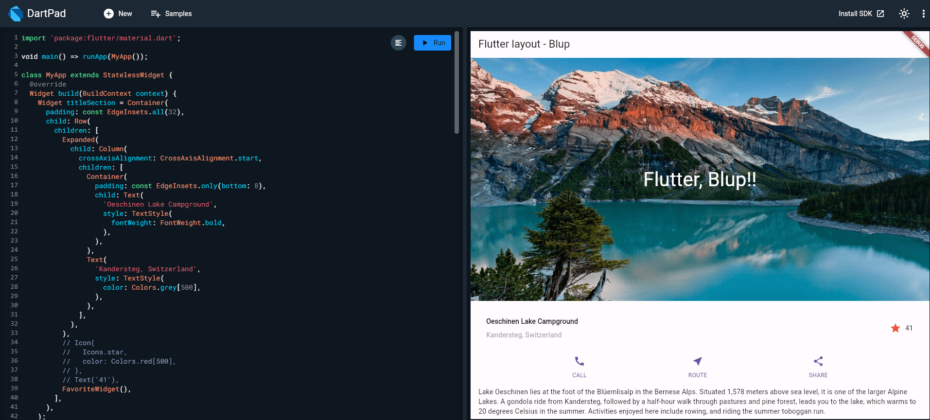
Step 1: Get Ready
Set up your development environment for creating a stateful widget.
Make sure you’ve set up your environment.
Replace the
lib/main.dartfile withmain.dart.Replace the
pubspec.yamlfile withpubspec.yaml.Create an
imagesdirectory in your project, and addlake.jpg.
Once you have a connected and enabled device, or you’ve launched the iOS simulator (part of the Flutter install) or the Android emulator (part of the Android Studio install), you are good to go!
Step 2: Decide Which Object Manages the Widget’s State
Understand whether the widget itself or its parent should manage its state.
A widget’s state can be managed in several ways, but in our example, the widget itself FavoriteWidg, will manage its state. In this example, toggling the star is an isolated action that doesn’t affect the parent widget or the rest of the UI, so the widget can handle its state internally.
Learn more about the separation of widget and state, and how state might be managed, in Managing state.
Step 3: Subclass StatefulWidget
Create a subclass of StatefulWidget to define the widget's state.
The FavoriteWidget class manages its own state, so it overrides createState() to create a State object. The framework calls createState() when it wants to build the widget. In this example, createState() returns an instance of _FavoriteWidgetState, which you’ll implement in the next step.
Step 4: Subclass State
Implement the State subclass to manage the widget's mutable state.
In Flutter, managing widget state is crucial for creating dynamic and interactive user interfaces. Let's explore how to subclass the state of a widget to handle mutable data and respond to user interactions.
Stateful Widget Setup:
The _FavoriteWidgetState class serves as the stateful component for our favorite widget. It contains mutable fields such as _isFavorited and _favoriteCount to track the widget's current state.
Building the Widget:
The build() method within _FavoriteWidgetState constructs the UI elements. It creates a row containing an IconButton and a Text widget to display the favorite count.
Handling User Interactions:
The _toggleFavorite() method is invoked when the IconButton is pressed. It updates the widget's state using the setState() function, triggering a redraw of the UI.
By subclassing the state of a widget and utilizing setState(), we can effectively manage the widget's mutable data and respond to user interactions in Flutter applications.
Step 5: Plug the Stateful Widget into the Widget Tree:
Integrate the stateful widget into the Flutter widget tree.
To incorporate your custom stateful widget into the widget tree, you'll need to add it to the app's build() method. Follow these steps to seamlessly integrate the stateful widget:
Replace Existing Code: Locate the code responsible for creating the Icon and Text widgets within your build() method. Remove this code to make space for your custom stateful widget.
Add Stateful Widget: In the same location where you removed the Icon and Text widgets, instantiate your stateful widget. Simply include the
FavoriteWidget()constructor to add it to the widget tree.
Problems?
If you can’t get your code to run, look in your IDE for possible errors. Debugging Flutter apps might help. If you still can’t find the problem, check your code against the interactive lakes example on GitHub.
If you still have questions, refer to any one of the developer community channels.
Managing State
Understanding State Management in Flutter Widgets
Why is state management important? As a widget designer, you have various options for managing state, and selecting the right approach is key. Whether the widget itself handles state, the parent widget manages it, or a combination of both depends on the specific requirements of your app.
Here are the main approaches to state management:
Widget Self-Management: In this approach, the widget itself manages its state. This is suitable for aesthetic changes like animations.
Parent Widget Management: When the state pertains to user data, such as checkbox status or slider position, it's best managed by the parent widget.
Mix-and-Match: Sometimes, a combination of both approaches is necessary to achieve the desired functionality.
How to Decide: When faced with the decision, consider these principles:
User data is typically managed by the parent widget.
Aesthetic changes are best handled by the widget itself.
When unsure, start by letting the parent widget manage the state.

These examples use GestureDetector to capture activity on the Container.

Discuss different approaches to managing state in Flutter:
The widget manages its state.
There are instances where it's most practical for a widget to handle its state internally. For example, ListView automatically scrolls when its content exceeds the render box. In such cases, the widget itself is responsible for managing its state to maintain desired behavior.
The _TapboxAState class:
Manages state for
TapboxA.Defines the
_activeboolean which determines the box’s current color.Defines the
_handleTap()function, which updates_activewhen the box is tapped and calls thesetState()function to update the UI.Implements all interactive behavior for the widget.
Managing State: The Parent Widget Approach
In many cases, it's practical for the parent widget to handle state management and communicate updates to its child widget. This approach ensures that the parent has control over when the child widget should update its state. For instance, the IconButton widget, which represents a tappable IconButton, is a stateless widget because its parent widget needs to know if the button has been tapped to perform appropriate actions.
ParentWidgetState Class:
Manages the state for
TapboxB.Implements the
_handleTapboxChanged()method, which is invoked when the box is tapped.Utilizes
setState()to trigger UI updates when the state changes.
TapboxB Class:
Extends StatelessWidget as all state management is delegated to its parent.
Notifies the parent widget when a tap is detected.
A mix-and-match approach combines both approaches.
In certain widget scenarios, adopting a mix-and-match strategy proves effective. Here, the stateful widget handles specific states, while the parent widget oversees others.
Consider TapboxC: upon tap down, a dark green border encircles the box, fading upon release, accompanied by a color change. Although TapboxC shares its _active state with the parent, it internally manages its _highlight state. This example utilizes two State objects: _ParentWidgetState and _TapboxCState.
The _ParentWidgetState object:
Manages the
_activestate.Implements
_handleTapboxChanged(), the method called when the box is tapped.Calls
setState()to update the UI when a tap occurs and the_activestate changes.
The _TapboxCState object:
Manages the
_highlightstate.The
GestureDetectorlistens to all tap events. As the user taps down, it adds the highlight (implemented as a dark green border). As the user releases the tap, it removes the highlight.Calls
setState()to update the UI on tap down, tap up, or tap cancel, and the_highlightstate changes.On a tap event, passes that state change to the parent widget to take appropriate action using the
widgetproperty.
An alternate implementation might have exported the highlight state to the parent while keeping the active state internal, but if you asked someone to use that tap box, they’d probably complain that it doesn’t make much sense. The developer cares whether the box is active. The developer probably doesn’t care how the highlighting is managed, and prefers that the tap box handles those details.
Other Interactive Widgets
Flutter offers a diverse array of buttons and interactive widgets, many of which adhere to the Material Design principles, providing a consistent and intuitive user interface.
Alternatively, if you require custom interactivity, you can utilize GestureDetector. Examples of GestureDetector usage can be found in the "Managing State" section. Further information on GestureDetector can be found in the "Handle Taps" recipe in the Flutter cookbook.
Tip: Flutter also offers iOS-style widgets known as Cupertino widgets.
When incorporating interactivity, leveraging prefabricated widgets is typically the simplest approach.
Standard widgets
Material Components
Flutter Learning Resources
Resources
The following resources might help when adding interactivity to your app.
Gestures,
a section in the Flutter cookbook.
Handling gestures
How to create a button and make it respond to input.
Gestures in Flutter
A description of Flutter’s gesture mechanism.
Flutter API documentation
Reference documentation for all of the Flutter libraries.
Wonderous app running app, repoFlutter showcase app with a custom design and engaging interactions.
Flutter’s Layered Design (video)
This video includes information about state and stateless widgets. Presented by Google engineer, Ian Hickson.
Resources to Get Started
Download Flutter App Builder "Blup"
Start Building with Blup - Blup's Role in App Development
Blup tool, with its user-friendly interface and powerful capabilities, stands out as an ideal solution for developing applications in the shipping industry. Here’s how Blup can be instrumental:
Ease of Use: One of the primary advantages of Blup is its simplicity and intuitiveness. Even those with minimal programming experience can navigate its interface to create functional and visually appealing apps.
Flexibility with Flutter: Built on the Flutter framework, Blup offers unparalleled flexibility. Flutter’s cross-platform development capabilities mean you can develop an app that runs smoothly on iOS and Android with a single codebase.
Rapid Prototyping: Blup enables quick prototyping, allowing businesses to develop and test their app ideas in a real-world environment rapidly. This particularly benefits the dynamic shipping industry, where market needs can change quickly.
🌟 Download the Blup Tool now and join the revolution of streamlined, no-code app development. Your journey towards creating amazing apps with ease starts here!
Introduce readers to our Flutter-based app builder "Blup" and encourage them to download and explore its features for building interactive Flutter apps effortlessly.
Blup Services
Introduce Blup Services as an end-to-end solution for readers' app development needs. Explain how Blup Services specializes in building custom Flutter apps, delivering them 10x faster and more cost-effectively than traditional methods.

Discover the Advantages of Blup Services:
Customized Flutter Apps: Unlock tailored solutions designed to address unique app needs and align with business goals.
Swift Development: Experience accelerated project timelines, resulting in prompt delivery of top-tier applications.
Cost Savings: Benefit from an optimized development process that maximizes efficiency, ultimately reducing overall project expenses.
Encourage readers to explore Blup Services for their app development endeavors. Take the next step by contacting Blup Services for a consultation or to delve deeper into the comprehensive range of services available.
Conclusion:
Mastering interactivity in Flutter app development is vital for creating compelling user experiences. By grasping concepts like GestureDetector and interactive widgets, developers can enhance their apps significantly.
Remember to refer back to the sections covered in this blog for a comprehensive understanding of Flutter app development:
Understanding Stateful and Stateless Widgets
Creating a Stateful Widget
Managing State
Exploring Other Interactive Widgets
Troubleshooting and Debugging
Download "Blup" to deepen your Flutter knowledge and explore the wealth of resources available. Engage with the Flutter community, share your experiences, and stay tuned for more insightful blogs in our Flutter Learning Roadmaps Series.


