

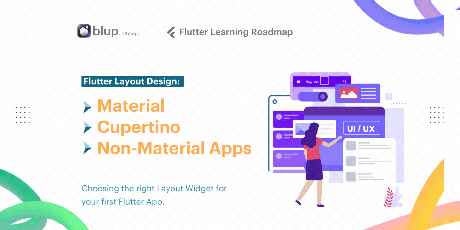
Flutter Layout Design: Material vs Cupertino for Your App
Introduction
Introduction
Introduction
Introduction
Navigating Flutter's Design Languages
Did you know that the design language you choose for your Flutter app can significantly impact its success? It's true! Flutter offers developers the flexibility to choose from various design languages, each with its own set of principles and aesthetics. Let's embark on a journey to explore these design languages - Material Design, Cupertino Design, and non-material design - and uncover their secrets to creating captivating user experiences.
Did you know that Google's Material Design language was inspired by the physical world and its textures?
By incorporating elements such as shadows and animations, Material Design aims to create interfaces that feel tangible and intuitive to users.
Top 5 "People Also Asked" Questions about Layout Widgets in Flutter.
How do I decide between Material Design and Cupertino Design for my Flutter app?
What are the key differences between Material Design and Cupertino Design in Flutter?
Can I mix Material Design and Cupertino Design elements in the same Flutter app?
Are there any performance considerations when choosing between Material and Cupertino design in Flutter?
How do I ensure a consistent user experience across platforms when using Material and Cupertino design in Flutter?
Material Design, introduced by Google, is a design language focused on providing a consistent user experience across different platforms and devices. It emphasizes bold colors, meaningful motion, and tactile surfaces to create intuitive interfaces.
Cupertino Design, inspired by Apple's iOS design language, is tailored for iOS app development in Flutter. It prioritizes clarity, depth, and deference, aiming to replicate the native iOS experience on Flutter apps.
Non-material design refers to custom design approaches that deviate from the predefined guidelines of Material Design or Cupertino Design. It offers developers creative freedom to design unique interfaces tailored to their app's branding or specific requirements.
Importance of Choosing the Right Design Language: Your choice of design language is more than just aesthetics; it's a strategic decision that can impact user engagement and retention. Consider this: a user familiar with iOS might find a Flutter app designed with Cupertino elements more intuitive and familiar, leading to increased user satisfaction and loyalty.
Material, Cupertino, and Non-Material Apps
Material, Cupertino, and Non-Material Apps
Material, Cupertino, and Non-Material Apps
Material, Cupertino, and Non-Material Apps
As we navigate the diverse landscape of Flutter's design languages, it's essential to understand how Material Design, Cupertino Design, and non-material design influence the layout of your app. Let's embark on a detailed exploration of the distinctive characteristics that set these design languages apart.
image.
Differences in Layout Design
The world of mobile app design is influenced by various design languages, each with its own set of principles and characteristics. This section dives deep into how Material Design, Cupertino Design, and non-material design approaches influence the layout choices made by developers. We'll explore the unique visual elements, navigation patterns, and overall aesthetics that define each language.
Material Design
MaterialApp is a predefined class or widget in a flutter. It is likely the main or core component of a Flutter app. The MaterialApp widget provides a wrapper around other Material Widgets. We can access all the other components and widgets provided by Flutter SDK.
Text widget, DropdownButton widget, AppBar widget, Scaffold widget, ListView widget,
StatelessWidget, StatefulWidget, IconButton widget, TextField widget, Padding widget, ThemeData widget, etc. are the widgets that can be accessed using the MaterialApp class.
Visual Elements: Material Design, developed by Google, emphasizes layers, depth, and physical qualities. It utilizes shadows, cards, and vibrant colors to create a sense of hierarchy and realism.
Navigation Patterns: Navigation in Material Design follows a bottom app bar or a hamburger menu approach, offering a consistent user experience across different app sections.
Overall Aesthetics: Material Design aims for a balanced, modern, and user-friendly look. It promotes a clean and organized layout with clear affordances for users to interact with the app's features.
Cupertino Design
Flutter offers Cupertino widgets that allow you to create user interfaces with an iOS-style look and feel. In this tutorial, we will explore the Cupertino widget set and demonstrate how to use these widgets to design an app with an iOS-like interface.
CupertinoNavigationBar: A navigation bar with iOS-style navigation.CupertinoButton: A button styled according to iOS guidelines.CupertinoTextField: A text input field with iOS styling.CupertinoPicker: A wheel-like picker control often used in iOS.CupertinoActionSheet: An iOS-style action sheet for presenting options.
Beautiful and high-fidelity widgets for the current iOS design language. See more widgets in the widget catalog.
Visual Elements: Cupertino Design, inspired by Apple's design language, focuses on flat elements, subtle shadows, and a minimalist aesthetic. It prioritizes clean lines, white space, and custom fonts for a sleek and sophisticated look.
Navigation Patterns: Cupertino Design utilizes a tab bar at the bottom of the screen for primary navigation. This pattern is commonly seen in many native iOS apps.
Overall Aesthetics: The overall aesthetic of Cupertino Design is one of simplicity and elegance. It strives for a user interface that is intuitive and visually appealing.
Non-Material Design
By default, a non-Material app doesn't include an AppBar, title, or background color. If you want these features in a non-Material app, you have to build them yourself. This app changes the background color to white and the text to dark grey to mimic a Material app. That's it!
Visual Elements: Non-material design encompasses a wide range of approaches that deviate from the established styles of Material Design and Cupertino Design. It allows for more creative freedom and customization, enabling developers to craft unique visual experiences.
Navigation Patterns: Navigation patterns in non-material design can be highly diverse. Developers may employ custom navigation bars, side menus, or gesture-based controls to create an innovative user experience.
Overall Aesthetics: The aesthetics of non-material design are entirely up to the developer's vision. This approach can be advantageous for creating apps that stand out from the crowd and offer a distinct brand identity.
Choosing the Appropriate Design Language
When embarking on your Flutter app development journey, one of the most critical decisions you'll face is selecting the appropriate design language. Whether it's Material Design, Cupertino Design, or a custom design language, each choice comes with its own set of considerations and implications. Let's delve into the factors you should weigh when making this decision and explore strategies for maintaining a consistent and appealing user experience across platforms.
Factors to Consider
Target Audience and Platform Preferences: Consider the demographics of your target audience and their platform preferences. Are they more accustomed to the Android Material Design aesthetic, or do they prefer the sleek simplicity of iOS Cupertino Design? Understanding your users' expectations is key to selecting the right design language.
Brand Identity and Messaging: Your app's design should reflect your brand identity and messaging. Consider whether Material Design, with its vibrant colors and bold typography, aligns with your brand's personality, or if Cupertino Design's minimalist aesthetic better complements your brand image.
Platform Consistency: If you're targeting multiple platforms, such as both Android and iOS, consider the importance of platform consistency. While Material Design and Cupertino Design offer platform-specific experiences, opting for a custom design language may require extra effort to ensure consistency across platforms.
Development Resources and Expertise: Assess your team's development resources and expertise. If you have experience with Material Design or Cupertino Design, leveraging these existing skills may streamline the development process. However, if you opt for a custom design language, be prepared to invest additional time and effort in implementation.
Tips for Maintaining Consistency
Design Language Guidelines: Adhere to the design language guidelines provided by Google for Material Design and Apple for Cupertino Design. Following these guidelines ensures a cohesive user experience and helps users feel familiar with your app's interface.
Component Libraries: Utilize component libraries and UI frameworks tailored to your chosen design language. These libraries offer pre-designed widgets and components that align with Material Design or Cupertino Design principles, saving you time and effort in implementation.
User Testing: Conduct user testing to gather feedback on your app's design across different platforms. Solicit input from users on usability, aesthetics, and overall satisfaction to identify areas for improvement and ensure a consistent and appealing user experience.
Iterative Design: Embrace an iterative design process, refining your app's design based on user feedback and evolving platform trends. Continuously iterate on your app's design to stay current with the latest design standards and ensure a delightful user experience.
Material Apps
Material Apps
Material Apps
Material Apps
Material Design is a design language developed by Google, offering a set of guidelines and principles for creating visually appealing and intuitive user interfaces. In Flutter, MaterialApp is a predefined class or widget in a flutter. It is likely the main or core component of a Flutter app. The MaterialApp widget provides a wrapper around other Material Widgets.
Let's explore some common Material app widgets along with their explanations:
AppBar:
The AppBar widget represents a Material Design app bar, typically positioned at the top of the screen. It provides space for a title, leading and trailing actions, and may also include a flexible space for additional content.
Scaffold(
  appBar: AppBar(
    title: Text('Material App Example'),
    actions: [
      IconButton(
        icon: Icon(Icons.search),
        onPressed: () {  // Add search action
        },
      ),
    ],
  ), // Other content goes here
)
Scaffold:
The Scaffold widget is the structural framework for Material Design apps. It provides layout components such as app bars, drawers, floating action buttons, and more, helping developers quickly create standard app layouts.
Scaffold(
  appBar: AppBar(
    title: Text('Material App Example'),
  ),
  body: Center(
    child: Text('Hello, Flutter!'),
  ),
)
FloatingActionButton:
The FloatingActionButton widget displays a circular button typically used for primary actions in an app. It floats above other content and can be customized with icons and background colors.
FloatingActionButton(
  onPressed: () {          // Add your onPressed action here
  },
  child: Icon(Icons.add),
  backgroundColor: Colors.blue,
)
IconButton:
The IconButton widget represents a button that displays an icon instead of text. It is often used for secondary or less prominent actions in an app, such as opening a menu or navigating to a different screen.
IconButton(
  icon: Icon(Icons.favorite),
  onPressed: () {             // Add your onPressed action here
  },
)
Text:
The Text widget displays text on the screen with customizable styles, including font size, color, alignment, and more. It is a fundamental widget for displaying labels, titles, and other textual content in Material Design apps.
Text(
  'Hello, Flutter!',
  style: TextStyle(fontSize: 20, fontWeight: FontWeight.bold),
)
Button:
The Button widget is a generic button component that can be styled and customized to represent different types of buttons, including raised, flat, and outline buttons. It provides flexibility for developers to create buttons that adhere to Material Design guidelines.
RaisedButton(
  onPressed: () {       // Add your onPressed action here
  },
  child: Text('Raised Button'),
)
Checkbox:
The Checkbox widget represents a checkbox input element, allowing users to toggle between two states (checked and unchecked). It is commonly used for selecting multiple options from a list or performing binary actions.
Checkbox(
  value: true,
  onChanged: (bool? newValue) {  // Add your onChanged action here
  },
)
Slider:
The Slider widget allows users to select a value from a continuous range by sliding a thumb along a track. It is often used for adjusting settings or parameters with a wide range of values, such as volume or brightness controls.
Slider(
  value: 0.5,
  onChanged: (double newValue) {    // Add your onChanged action here
  },
)
Card:
The Card widget represents a Material Design card, which is a rectangular surface with rounded corners and a shadow. Cards are used to display related content, such as images, text, and buttons, in a visually appealing and organized manner.
Card(
  child: Padding(
    padding: EdgeInsets.all(16),
    child: Text('This is a card widget example'),
  ),
)
Drawer:
The Drawer widget displays a hidden side menu that can be revealed by swiping from the left edge of the screen or tapping on a menu icon. It provides navigation options and additional functionality, such as settings and user profiles, in Material Design apps.
Card(
  child: Padding(
    padding: EdgeInsets.all(16),
    child: Text('This is a card widget example'),
  ),
)
Example:
import 'package:flutter/material.dart';

void main() {
  runApp(MaterialApp(
    home: MyApp(),
  ));
}

class MyApp extends StatelessWidget {
  @override
  Widget build(BuildContext context) {
    return Scaffold(
      appBar: AppBar(
        title: Text('Material App Widgets - Blup'),
      ),
      body: Padding(
        padding: EdgeInsets.all(16),
        child: Column(
          crossAxisAlignment: CrossAxisAlignment.start,
          children: [
            Text(
              'Hello, Flutter!',
              style: TextStyle(fontSize: 24, fontWeight: FontWeight.bold),
            ),
            SizedBox(height: 20),
            ElevatedButton(
              onPressed: () {
                // Add your onPressed action here
              },
              child: Text('Click Me'),
            ),
            SizedBox(height: 10),
            FloatingActionButton(
              onPressed: () {
                // Add your onPressed action here
              },
              child: Icon(Icons.add),
            ),
            SizedBox(height: 10),
            Checkbox(
              value: true,
              onChanged: (bool? newValue) {
                // Add your onChanged action here
              },
            ),
            SizedBox(height: 10),
            Card(
              elevation: 4,
              child: Padding(
                padding: EdgeInsets.all(16),
                child: Text('This is a Material Card'),
              ),
            ),
          ],
        ),
      ),
      drawer: Drawer(
        child: ListView(
          padding: EdgeInsets.zero,
          children: <Widget>[
            DrawerHeader(
              decoration: BoxDecoration(
                color: Colors.blue,
              ),
              child: Text(
                'Drawer Header',
                style: TextStyle(color: Colors.white, fontSize: 20),
              ),
            ),
            ListTile(
              title: Text('Drawer Item 1'),
              onTap: () { // Add your onTap action herE
              },
            ),
            ListTile(
              title: Text('Drawer Item 2'),
              onTap: () { // Add your onTap action here
              },
            ),
          ],
        ),
      ),
    );
  }
}
Output:
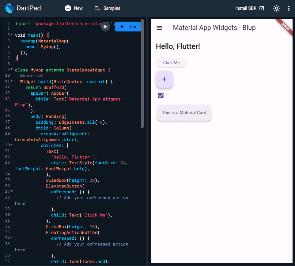
This Flutter application showcases the usage of common Material Design widgets. Beginning with importing `material.dart`, it sets up a `MaterialApp` with a custom `MyApp` class as the home screen. Within `MyApp`, a `Scaffold` widget defines the layout structure, including an app bar and body with a `Column`. The body contains various Material Design widgets like `Text`, `ElevatedButton`, `FloatingActionButton`, `Checkbox`, and `Card`. Additionally, a `Drawer` widget provides a side drawer for navigation options.
Material Design is a design language developed by Google, offering a set of guidelines and principles for creating visually appealing and intuitive user interfaces. In Flutter, MaterialApp is a predefined class or widget in a flutter. It is likely the main or core component of a Flutter app. The MaterialApp widget provides a wrapper around other Material Widgets.
Let's explore some common Material app widgets along with their explanations:
AppBar:
The AppBar widget represents a Material Design app bar, typically positioned at the top of the screen. It provides space for a title, leading and trailing actions, and may also include a flexible space for additional content.
Scaffold(
  appBar: AppBar(
    title: Text('Material App Example'),
    actions: [
      IconButton(
        icon: Icon(Icons.search),
        onPressed: () {  // Add search action
        },
      ),
    ],
  ), // Other content goes here
)
Scaffold:
The Scaffold widget is the structural framework for Material Design apps. It provides layout components such as app bars, drawers, floating action buttons, and more, helping developers quickly create standard app layouts.
Scaffold(
  appBar: AppBar(
    title: Text('Material App Example'),
  ),
  body: Center(
    child: Text('Hello, Flutter!'),
  ),
)
FloatingActionButton:
The FloatingActionButton widget displays a circular button typically used for primary actions in an app. It floats above other content and can be customized with icons and background colors.
FloatingActionButton(
  onPressed: () {          // Add your onPressed action here
  },
  child: Icon(Icons.add),
  backgroundColor: Colors.blue,
)
IconButton:
The IconButton widget represents a button that displays an icon instead of text. It is often used for secondary or less prominent actions in an app, such as opening a menu or navigating to a different screen.
IconButton(
  icon: Icon(Icons.favorite),
  onPressed: () {             // Add your onPressed action here
  },
)
Text:
The Text widget displays text on the screen with customizable styles, including font size, color, alignment, and more. It is a fundamental widget for displaying labels, titles, and other textual content in Material Design apps.
Text(
  'Hello, Flutter!',
  style: TextStyle(fontSize: 20, fontWeight: FontWeight.bold),
)
Button:
The Button widget is a generic button component that can be styled and customized to represent different types of buttons, including raised, flat, and outline buttons. It provides flexibility for developers to create buttons that adhere to Material Design guidelines.
RaisedButton(
  onPressed: () {       // Add your onPressed action here
  },
  child: Text('Raised Button'),
)
Checkbox:
The Checkbox widget represents a checkbox input element, allowing users to toggle between two states (checked and unchecked). It is commonly used for selecting multiple options from a list or performing binary actions.
Checkbox(
  value: true,
  onChanged: (bool? newValue) {  // Add your onChanged action here
  },
)
Slider:
The Slider widget allows users to select a value from a continuous range by sliding a thumb along a track. It is often used for adjusting settings or parameters with a wide range of values, such as volume or brightness controls.
Slider(
  value: 0.5,
  onChanged: (double newValue) {    // Add your onChanged action here
  },
)
Card:
The Card widget represents a Material Design card, which is a rectangular surface with rounded corners and a shadow. Cards are used to display related content, such as images, text, and buttons, in a visually appealing and organized manner.
Card(
  child: Padding(
    padding: EdgeInsets.all(16),
    child: Text('This is a card widget example'),
  ),
)
Drawer:
The Drawer widget displays a hidden side menu that can be revealed by swiping from the left edge of the screen or tapping on a menu icon. It provides navigation options and additional functionality, such as settings and user profiles, in Material Design apps.
Card(
  child: Padding(
    padding: EdgeInsets.all(16),
    child: Text('This is a card widget example'),
  ),
)
Example:
import 'package:flutter/material.dart';

void main() {
  runApp(MaterialApp(
    home: MyApp(),
  ));
}

class MyApp extends StatelessWidget {
  @override
  Widget build(BuildContext context) {
    return Scaffold(
      appBar: AppBar(
        title: Text('Material App Widgets - Blup'),
      ),
      body: Padding(
        padding: EdgeInsets.all(16),
        child: Column(
          crossAxisAlignment: CrossAxisAlignment.start,
          children: [
            Text(
              'Hello, Flutter!',
              style: TextStyle(fontSize: 24, fontWeight: FontWeight.bold),
            ),
            SizedBox(height: 20),
            ElevatedButton(
              onPressed: () {
                // Add your onPressed action here
              },
              child: Text('Click Me'),
            ),
            SizedBox(height: 10),
            FloatingActionButton(
              onPressed: () {
                // Add your onPressed action here
              },
              child: Icon(Icons.add),
            ),
            SizedBox(height: 10),
            Checkbox(
              value: true,
              onChanged: (bool? newValue) {
                // Add your onChanged action here
              },
            ),
            SizedBox(height: 10),
            Card(
              elevation: 4,
              child: Padding(
                padding: EdgeInsets.all(16),
                child: Text('This is a Material Card'),
              ),
            ),
          ],
        ),
      ),
      drawer: Drawer(
        child: ListView(
          padding: EdgeInsets.zero,
          children: <Widget>[
            DrawerHeader(
              decoration: BoxDecoration(
                color: Colors.blue,
              ),
              child: Text(
                'Drawer Header',
                style: TextStyle(color: Colors.white, fontSize: 20),
              ),
            ),
            ListTile(
              title: Text('Drawer Item 1'),
              onTap: () { // Add your onTap action herE
              },
            ),
            ListTile(
              title: Text('Drawer Item 2'),
              onTap: () { // Add your onTap action here
              },
            ),
          ],
        ),
      ),
    );
  }
}
Output:
This Flutter application showcases the usage of common Material Design widgets. Beginning with importing `material.dart`, it sets up a `MaterialApp` with a custom `MyApp` class as the home screen. Within `MyApp`, a `Scaffold` widget defines the layout structure, including an app bar and body with a `Column`. The body contains various Material Design widgets like `Text`, `ElevatedButton`, `FloatingActionButton`, `Checkbox`, and `Card`. Additionally, a `Drawer` widget provides a side drawer for navigation options.
Cupertino apps
Cupertino apps
Cupertino apps
Cupertino apps
Cupertino Design brings the native iOS experience to Flutter apps with a set of widgets tailored for iOS users.
Let's explore some of the most common Cupertino widgets and how they are used in Flutter apps.
CupertinoNavigationBar
The CupertinoNavigationBar widget displays a navigation bar typically found at the top of iOS apps. It includes a title, leading and trailing widgets, and optional middle content.
CupertinoPageScaffold(
  navigationBar: CupertinoNavigationBar(
    middle: Text('Title'),
    trailing: CupertinoButton(
      child: Text('Edit'),
      onPressed: () {          // Add your onPressed action here
      },
    ),
  ),
  child: Center(
    child: Text('Your Page Content Here'),
  ),
)
CupertinoTabBar
The CupertinoTabBar widget displays a tab bar at the bottom of the screen, allowing users to switch between different sections of the app.
CupertinoTabScaffold(
  tabBar: CupertinoTabBar(
    items: [
      BottomNavigationBarItem(
        icon: Icon(CupertinoIcons.home),
        label: 'Home',
      ),
      BottomNavigationBarItem(
        icon: Icon(CupertinoIcons.search),
        label: 'Search',
      ),
      BottomNavigationBarItem(
        icon: Icon(CupertinoIcons.settings),
        label: 'Settings',
      ),
    ],
  ),
  tabBuilder: (BuildContext context, int index) {
    return Center(   // Add your tab content here based on the index
      child: Text('Tab $index Content'),
    );
  },
)
CupertinoButton
The CupertinoButton widget creates a button with an iOS-style design, including rounded corners and subtle shadows.
CupertinoButton(
  child: Text('Press Me'),
  onPressed: () {     // Add your onPressed action here
  },
)
CupertinoSwitch
The CupertinoSwitch widget displays an iOS-style switch toggle, allowing users to toggle a setting on or off.
CupertinoSwitch(
  value: true,
  onChanged: (bool? newValue) { // Add your onChanged action here
  },
)
CupertinoPicker
The CupertinoPicker widget displays a scrollable list of items, allowing users to select one or more options.
CupertinoPicker(
  itemExtent: 32.0,
  onSelectedItemChanged: (int index) {  // Add your onSelectedItemChanged action here
  },
  children: <Widget>
CupertinoAlertDialog
The CupertinoAlertDialog widget displays an iOS-style alert dialog with a title, content, and optional actions.
showDialog(
  context: context,
  builder: (BuildContext context) {
    return CupertinoAlertDialog(
      title: Text('Alert Title'),
      content: Text('This is the alert content.'),
      actions: <Widget>[
        CupertinoDialogAction(
          child: Text('Cancel'),
          onPressed: () {  // Add your onPressed action here
            Navigator.of(context).pop();
          },
        ),
        CupertinoDialogAction(
          child: Text('OK'),
          onPressed: () { // Add your onPressed action here
            Navigator.of(context).pop();
          },
        ),
      ],
    );
  },
)
In this embedding dartpad code below demonstrates the implementation of Cupertino Design elements in a Flutter app. The CupertinoApp and CupertinoPageScaffold widgets set up the app structure, including the navigation bar with a title and a trailing button. The trailing button, a CupertinoButton with an info icon, triggers the display of an action sheet when pressed. Additionally, a CupertinoButton in the center of the page responds to user interaction by displaying a Cupertino-style alert dialog. These widgets and interactions showcase the native iOS-like experience achievable with Flutter's Cupertino Design.
Non-Material apps
Non-Material apps
Non-Material apps
Non-Material apps
Non-material design
Non-material design approaches in Flutter allow developers to break away from the traditional Material Design guidelines and create unique and customized user interfaces tailored to specific app requirements. While Material Design provides a robust framework for building visually consistent and intuitive apps, there are scenarios where developers may opt for non-material Design approaches to achieve a distinct look and feel.
Most common widgets
Let's explore some of the most common widgets used in non-Material Design approaches, along with code snippet examples:
Custom App Bar
A custom app bar allows developers to design a unique and personalized navigation bar for their app, deviating from the standard Material Design app bar. This approach is often used to create immersive and branded experiences.
import 'package:flutter/material.dart';

void main() {
  runApp(MaterialApp(
    home: Scaffold(
      appBar: PreferredSize(
        preferredSize: Size.fromHeight(100),
        child: Container(
          color: Colors.blue,
          alignment: Alignment.center,
          child: Text(
            'Custom App Bar',
            style: TextStyle(color: Colors.white, fontSize: 20),
          ),
        ),
      ),
      body: Center(
        child: Text('Custom App Bar Example'),
      ),
    ),
  ));
}
Custom Buttons
Custom buttons allow developers to create visually distinct buttons with unique shapes, colors, and animations, deviating from the standard Material Design buttons.
import 'package:flutter/material.dart';

void main() {
  runApp(MaterialApp(
    home: Scaffold(
      body: Center(
        child: FlatButton(
          onPressed: () {},
          color: Colors.blue,
          padding: EdgeInsets.symmetric(vertical: 15, horizontal: 30),
          shape: RoundedRectangleBorder(
            borderRadius: BorderRadius.circular(10),
          ),
          child: Text(
            'Custom Button',
            style: TextStyle(color: Colors.white),
          ),
        ),
      ),
    ),
  ));
}
Custom Navigation
Custom navigation widgets allow developers to implement unique navigation patterns, such as swipe-based navigation, gestures, or non-linear navigation flows, to provide a tailored user experience.
// Custom navigation example using PageView widget
import 'package:flutter/material.dart';

void main() {
  runApp(MaterialApp(
    home: CustomNavigationExample(),
  ));
}

class CustomNavigationExample extends StatelessWidget {
  @override
  Widget build(BuildContext context) {
    return Scaffold(
      body: PageView(
        children: [
          Container(color: Colors.red),
          Container(color: Colors.green),
          Container(color: Colors.blue),
        ],
      ),
    );
  }
}
Custom Animations
Custom animation widgets allow developers to create visually engaging and interactive animations that enhance the user experience, such as complex transitions, parallax effects, or custom loading indicators.
// Custom animation example using AnimatedContainer widget
import 'package:flutter/material.dart';

void main() {
  runApp(MaterialApp(
    home: CustomAnimationExample(),
  ));
}

class CustomAnimationExample extends StatefulWidget {
  @override
  _CustomAnimationExampleState createState() => _CustomAnimationExampleState();
}

class _CustomAnimationExampleState extends State<CustomAnimationExample> {
  bool _isExpanded = false;

  @override
  Widget build(BuildContext context) {
    return Scaffold(
      body: Center(
        child: GestureDetector(
          onTap: () {
            setState(() {
              _isExpanded = !_isExpanded;
            });
          },
          child: AnimatedContainer(
            duration: Duration(milliseconds: 500),
            width: _isExpanded ? 200 : 100,
            height: _isExpanded ? 200 : 100,
            color: Colors.blue,
            child: Center(
              child: Text(
                'Tap to Expand',
                style: TextStyle(color: Colors.white),
              ),
            ),
          ),
        ),
      ),
    );
  }
}
Implementation Tips and Best Practices
Implementation Tips and Best Practices
Implementation Tips and Best Practices
Implementation Tips and Best Practices
Section 6: Implementation Tips and Best Practices
Cross-Platform Considerations
Creating layouts that seamlessly adapt to both Android and iOS platforms is essential for providing a consistent user experience across devices. Here are some strategies to achieve cross-platform compatibility:
Responsive Layouts: Use Flutter's flexible layout widgets like
Row,Column, andFlexto create responsive designs that adjust dynamically based on screen size and orientation.Platform-Specific Widgets: Leverage platform-specific widgets and features using Flutter's platform channels to provide a native look and feel on both Android and iOS platforms.
Testing and Optimization: Regularly test your app on different devices and platforms to ensure compatibility and performance. Optimize layout and performance using Flutter's built-in tools like the Flutter Performance Monitor.
Customization and Theming
Customizing layouts within Material and Cupertino design languages allows developers to tailor the app's visual identity and branding. Here are some tips for customization and theming:
Color Palette: Define a consistent color palette for your app using Flutter's
Colorclass or custom color schemes. Consider using primary, secondary, and accent colors to create a cohesive visual identity.Typography: Choose appropriate typography styles for your app's text elements, including font family, weight, size, and color. Flutter provides a range of built-in typography widgets and styles for easy customization.
Custom Themes: Use Flutter's
Themewidget to define custom themes for your app, including colors, typography, and other visual elements. This allows you to apply consistent styling across your app and easily switch between different themes.Accessibility: Ensure that your customized layouts are accessible to all users by following accessibility best practices. Provide alternative text for images, use semantic markup for screen readers, and ensure sufficient color contrast for readability.
Join the Flutter Learning Community
Join the Flutter Learning Community
Join the Flutter Learning Community
Join the Flutter Learning Community
As you embark on your journey to master Flutter, joining a vibrant and supportive learning community can be immensely beneficial. Whether you're a beginner seeking guidance or an experienced developer looking to stay updated on the latest trends and best practices, being part of a community can provide invaluable support, encouragement, and knowledge sharing opportunities.
Why Join a Flutter Learning Community?
Support and Guidance: Learning Flutter can sometimes feel overwhelming, but with a community by your side, you'll have access to fellow developers who can offer support, answer questions, and provide guidance along the way.
Networking Opportunities: Connecting with other Flutter enthusiasts opens doors to networking opportunities, collaborations, and potential career advancements within the Flutter ecosystem.
Stay Updated: Flutter is constantly evolving, with new features, updates, and plugins being released regularly. Being part of a community ensures you stay updated on the latest developments and trends in the Flutter world.
Share Knowledge: By participating in discussions, sharing your experiences, and contributing to open-source projects, you not only solidify your own understanding of Flutter but also help others learn and grow.
How to Get Involved
Join Online Forums: Platforms like Stack Overflow, Reddit's r/FlutterDev, and the official Flutter Discord channel are excellent places to ask questions, share knowledge, and engage with the Flutter community.
Attend Meetups and Events: Look for local Flutter meetups, conferences, and workshops in your area. These events provide opportunities to connect with like-minded individuals, learn from experts, and gain valuable insights.
Contribute to Open Source: Get involved in open-source Flutter projects on GitHub. Contributing to projects not only enhances your skills but also allows you to collaborate with other developers and make a meaningful impact on the Flutter community.
Follow Blogs and Tutorials: Stay updated on the latest Flutter tutorials, articles, and blogs from reputable sources. Platforms like Medium, Dev.to, and the official Flutter blog offer a wealth of resources to enhance your learning journey.
Resources to Get Started
Joining the Flutter learning community is not just about gaining knowledge; it's about building connections, fostering collaborations, and being part of a global movement that's shaping the future of mobile app development. So don't hesitate—dive in, engage with your peers, and let the Flutter community empower you on your learning journey!
Conclusion
Conclusion
Conclusion
Conclusion
Recap and Next Steps
In this blog, we've delved deep into the world of layout design in Flutter, exploring the nuances of Material, Cupertino, and non-material approaches. Let's recap some key takeaways and discuss the next steps for your Flutter journey.
Key Takeaways:
Understanding Design Languages: We've gained insights into the principles and aesthetics of Material Design, Cupertino Design, and non-material approaches, understanding their impact on layout choices and user experience.
Choosing the Right Design Language: By exploring the distinctive features and styling elements of each design language, we've learned how to select the appropriate design language based on our app's target audience and platform requirements.
Showcasing Examples: Through real-world examples and code snippets, we've showcased the use of common widgets and design patterns in Material, Cupertino, and non-Material Flutter apps, providing practical insights into layout design best practices.
Next Steps:
Further Exploration: To deepen your understanding of layout design in Flutter, consider exploring advanced topics such as responsive design, theming, and animation. Experiment with different layout widgets and design languages to expand your repertoire and enhance your app development skills.
Practical Application: Apply the knowledge and techniques gained from this blog to your Flutter projects. Experiment with different design languages and widget combinations to create visually appealing and user-friendly interfaces that delight your users.
Keep exploring, experimenting, and pushing the boundaries of design innovation in Flutter!
Table of content

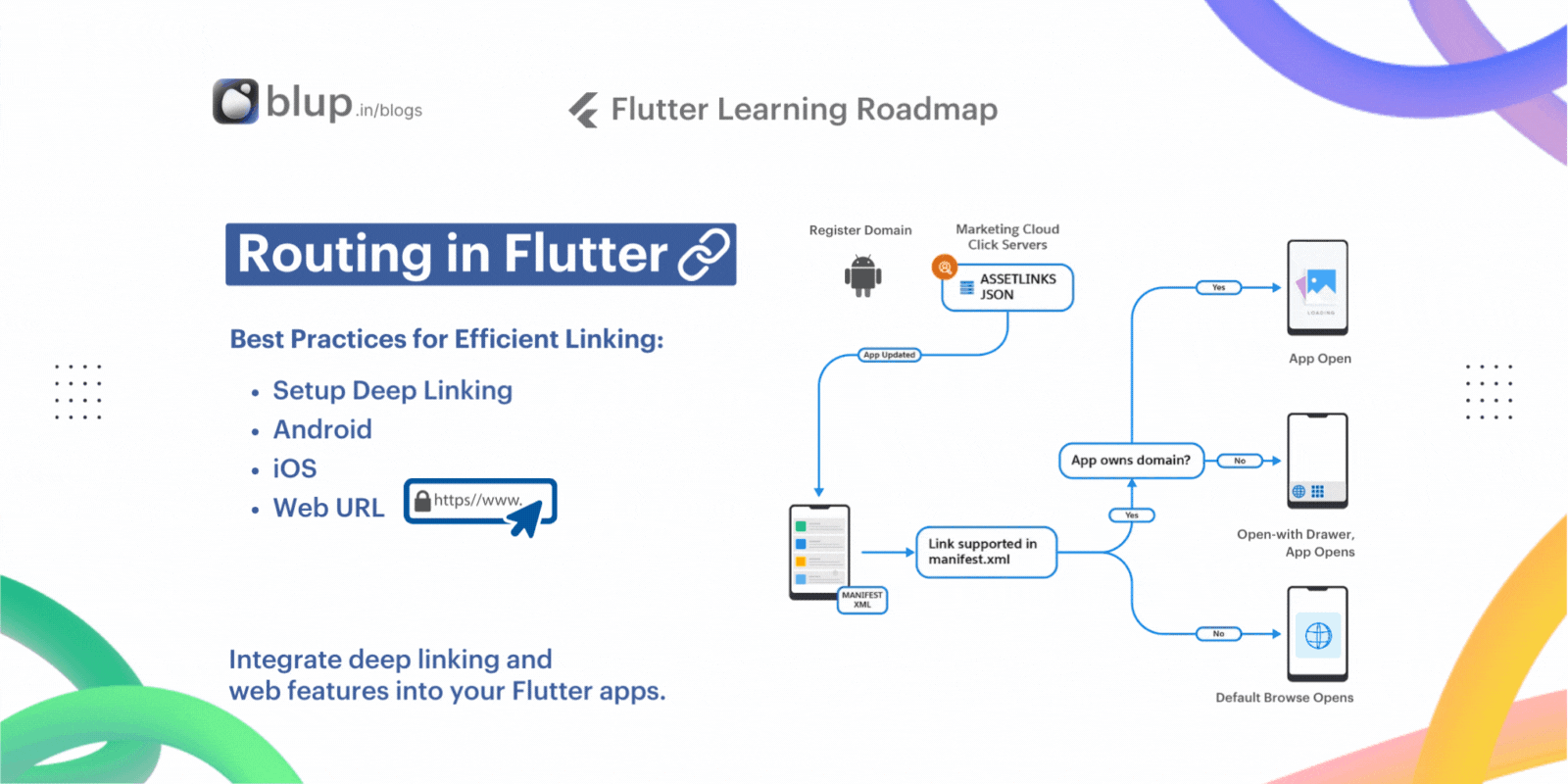


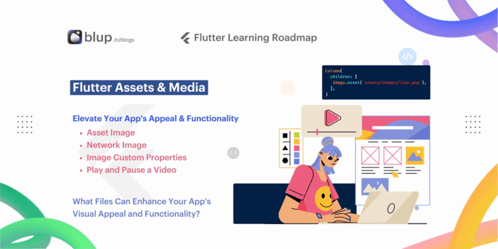


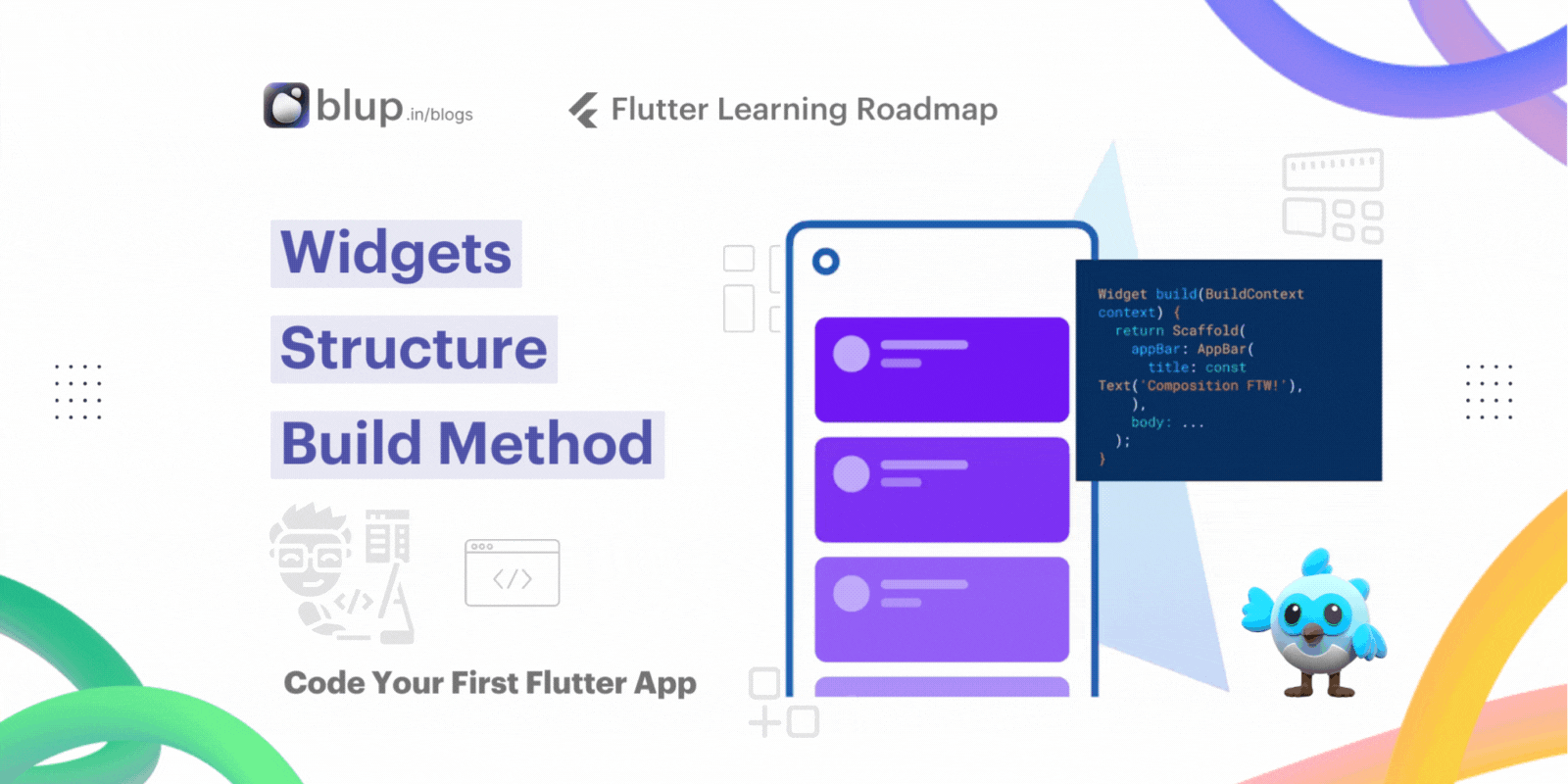


© 2021-25 Blupx Private Limited.
All rights reserved.
© 2021-25 Blupx Private Limited.
All rights reserved.
© 2021-25 Blupx Private Limited.
All rights reserved.