

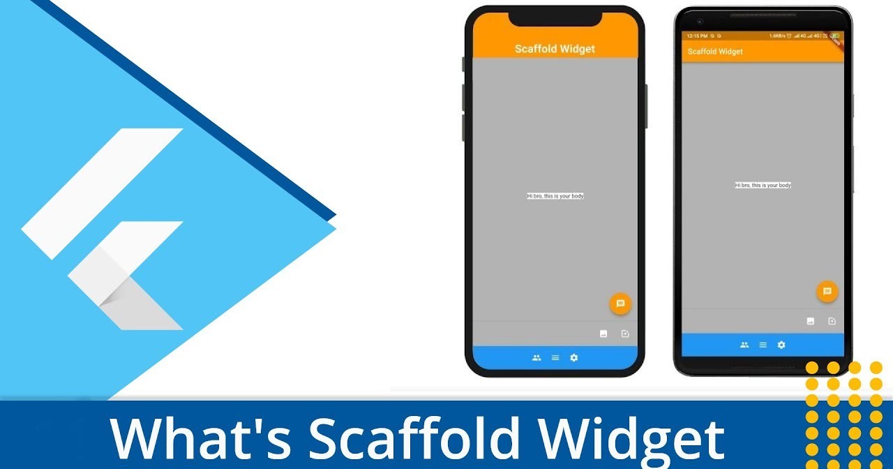
Flutter Scaffold: How to implement and use Flutter Scaffold Class
In the realm of mobile app development, delivering a seamless user experience is paramount. A visually consistent and appealing user interface (UI) not only attracts users but also enhances their engagement. To achieve this, developers often adhere to design guidelines that prioritize elements like Material Design, Google's comprehensive design language for creating intuitive and attractive apps.
At the core of implementing Material Design layouts in Flutter lies the indispensable `Scaffold` widget. Serving as a cornerstone, the `Scaffold` widget encapsulates the essential layout structure of a Flutter app. It streamlines the construction of key UI components, including the app bar, body, floating action button, and drawer. Through this widget, developers gain a structured approach to building sleek and user-friendly interfaces that align with Material Design principles.
So, let's delve into the world of the Flutter `Scaffold` widget and uncover how it empowers developers to craft remarkable user experiences.
Benefits of Using the Scaffold Widget
While the Flutter `Scaffold` widget might not be mandatory, its incorporation into app development is not just a convenience – it’s a strategic move. This widget, serving as a layout foundation, offers a plethora of advantages that significantly impact both the development process and the final user experience.
First and foremost, the `Scaffold` widget ensures consistency across your app's visual elements. In the dynamic world of multi-device compatibility, maintaining a uniform look and feel is paramount. Whether your app runs on a compact smartphone or a spacious tablet, the `Scaffold` widget guarantees that your app retains its identity, fostering user familiarity and trust.
Beyond consistency, the `Scaffold` widget streamlines efficiency. Instead of grappling with intricate low-level layout details, developers can focus on implementing features and functionality. This abstraction simplifies coding, accelerates development cycles, and reduces the likelihood of errors, ultimately resulting in a more streamlined and maintainable codebase.
Moreover, the `Scaffold` widget is inherently extensible. While it provides a set of pre-defined UI components like the app bar, body, and floating action button, it remains highly customizable. This enables developers to seamlessly integrate unique features and functionalities that align with the app's purpose. The extensibility empowers developers to go beyond the standard offerings and craft tailor-made experiences that resonate with users.
In essence, the `Scaffold` widget encapsulates the trifecta of consistency, efficiency, and extensibility, making it a must-have tool in the Flutter developer's arsenal.
Exploring the Scaffold Widget Components
The Flutter `Scaffold` widget is a treasure trove of components that collectively create a cohesive and user-friendly Material Design layout. Delving into its intricacies, we unravel a world of possibilities that empower developers to craft visually stunning and highly functional mobile applications.
App Bar: The app bar is more than just a decorative element – it’s the face of your application. By integrating an app bar using the `appBar` property, developers instantly provide users with a clear context. Setting a title via the `Text` widget is just the beginning; the app bar is also receptive to icons or buttons on the leading or trailing side. These additions not only enhance aesthetics but also facilitate user interactions, making navigation a breeze.
Body: The body, as the primary content area of the screen, beckons users to engage. Through the `
body` property, this canvas welcomes a plethora of widgets, from text to images and interactive elements. Its central positioning is default, but `Align` and `Center` widgets allow for precise adjustments. This dynamic content space is the hub of user interactions, enabling the app to deliver its core functionalities.Floating Action Button: Flutter wouldn't be complete without the floating action button. Invoked by the `
floatingActionButton` property, this omnipresent button serves as a call-to-action. Adding icons is as simple as integrating the `Icon` widget, while its `onPressed` callback function enables the execution of essential actions. From adding items to cart to composing messages, the floating action button amplifies user engagement with swift convenience.Drawer: Need a space for additional navigation options or settings? Enter the drawer, accessed by the `
drawer` property. This slide-out panel provides an elegant solution for decluttering the main interface while granting quick access to essential functions. Beyond its innate utility, customization is a hallmark of the drawer. You can craft a bespoke experience using `ListView`, adding icons, images, or even widgets to align with your app's aesthetics.Bottom Navigation Bar: Navigating across app sections is seamless with the `
bottomNavigationBar`. A steadfast staple of mobile app design, this component offers users an intuitive and accessible way to switch between primary destinations. The `BottomNavigationBar` widget embraces multiple items, each represented by an icon and label, thereby enabling quick route changes without disrupting the user flow.Persistent Footer Buttons: In the realm of multitasking, persistent footer buttons prove invaluable. Scrolling through content shouldn't require forfeiting essential actions, and that's where these buttons come into play. Residing below the `
bottomNavigationBar`, they remain steadfast, ensuring that pivotal actions like "Save" or "Delete" are perpetually accessible.End Drawer: Mirroring the drawer's functionality, the `
endDrawer` is a symmetrical space, stationed on the opposite side of the screen. While its purpose remains consistent, its placement offers an ergonomic touch for right-handed users, catering to user preferences and inclusivity.Primary Property: The `primary` property has a subtle yet impactful role. When set to true, the `AppBar` takes on a heightened form, extending its dimensions to accommodate the status bar's height. This configuration is particularly useful when your app's design involves intricate alignments with the status bar.
Background Color: The visual narrative of your app can be enhanced by customizing the `Scaffold` background color. By configuring the `
backgroundColor` property, you can harmonize the backdrop with your app's theme, fostering a visually unified user experience.Resize To Avoid Bottom Insets: Handling keyboard interactions becomes more elegant with the `
resizeToAvoidBottomInset` property. When set to true, the `Scaffold` and its floating widgets gracefully adapt to the on-screen keyboard's presence, ensuring that user interactions aren't hindered by occluded UI elements.
In conclusion, the Flutter `Scaffold` widget isn't merely a container; it's a catalyst for crafting engaging and polished user interfaces. The meticulous fusion of the app bar, body, floating action button, drawer, and other components forms a harmonious symphony that resonates with users, delivering an immersive and seamless app experience.
Creating a Sample Material Design App with Flutter Scaffold Class
Let's embark on a hands-on journey to craft a simple yet elegant Flutter app using the versatile Scaffold widget. By the end of this walkthrough, you'll have gained a practical understanding of how to seamlessly integrate each component of the Scaffold to build a Material Design-inspired interface.
Set Up the Project
Begin by creating a new Flutter project and replacing the boilerplate code in the main.dart file with the following:
Implementing the Scaffold
Now, let's dive into the main attraction – the MyScaffoldApp class. In this class, we'll weave together all the essential components of the Scaffold.
You can access the entire code here following the embedded URL here
<iframe src="https://zapp.run/edit/zv5206l0w530?theme=dark&lazy=false" style="width: 100%; height: 100%; border: 0; overflow: hidden;"></iframe>
or copy paste below code in Flutter IDE
import 'package:flutter/material.dart';
/// Flutter code sample for [Scaffold].
void main() => runApp(const ScaffoldExampleApp());
class ScaffoldExampleApp extends StatelessWidget {
const ScaffoldExampleApp({super.key});
@override
Widget build(BuildContext context) {
return const MaterialApp(
home: ScaffoldExample(),
);
}
}
class ScaffoldExample extends StatefulWidget {
const ScaffoldExample({super.key});
@override
State<ScaffoldExample> createState() => _ScaffoldExampleState();
}
class _ScaffoldExampleState extends State<ScaffoldExample> {
int _count = 0;
@override
Widget build(BuildContext context) {
return Scaffold(
appBar: AppBar(
title: const Text('Flutter Scaffold Demo'),
),
body: Center(
child: Text("You have pressed the button $_count times.",
style: TextStyle(
color: Color.fromARGB(255, 243, 22, 22),
fontSize: 25,
fontStyle: FontStyle.italic,
),
),
),
backgroundColor: Color.fromARGB(255, 115, 166, 244),
bottomNavigationBar: BottomNavigationBar(
items: const <BottomNavigationBarItem>[
BottomNavigationBarItem(
icon: Icon(Icons.home),
label: 'Home',
),
BottomNavigationBarItem(
icon: Icon(Icons.business),
label: 'Business',
),
BottomNavigationBarItem(
icon: Icon(Icons.school),
label: 'School',
),
],
),
floatingActionButton: FloatingActionButton(
onPressed: () => setState(() {
_count++;
}),
tooltip: 'Increment Counter',
child: const Icon(Icons.add),
),
floatingActionButtonLocation: FloatingActionButtonLocation.centerDocked,
drawer: Drawer(
child: ListView(
padding: EdgeInsets.zero,
children: const <Widget>[
DrawerHeader(
decoration: BoxDecoration(
color: Colors.blue,
),
child: Text(
'Drawer Header',
style: TextStyle(
color: Colors.white,
fontSize: 24,
),
),
),
ListTile(
leading: Icon(Icons.message),
title: Text('Messages'),
),
ListTile(
leading: Icon(Icons.account_circle),
title: Text('Profile'),
),
ListTile(
leading: Icon(Icons.settings),
title: Text('Settings'),
),
],
),
),
);
}
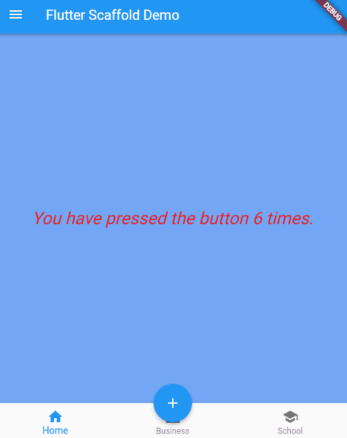
}The demo app looks like below:
Understanding the Components
App Bar: The AppBar component crowns your app with a title and additional actions. In our example, we've added a search icon button that triggers a search action upon tapping.
Body: The body is the canvas where your app's primary content resides. We've used the Center widget to elegantly position our welcome message.
Floating Action Button: This circular button, when pressed, triggers an action. We've adorned it with a plus icon for a compelling call-to-action effect.
The MaterialApp Entry Point
The MaterialApp widget at the heart of your app ensures consistency and adherence to Material Design principles. It serves as the entry point, orchestrating the visual and structural aspects of your application.
In a nutshell, the Scaffold widget is your ally in crafting engaging and visually harmonious Material Design layouts. By effortlessly integrating components like the app bar, body, and floating action button, you create an app that adheres to design best practices and provides an immersive user experience.
Best Practices and Tips for Scaffold Class
Mastering the `Scaffold` widget involves not just its components, but also understanding the best practices that ensure smooth app development. Here are some tips to keep in mind:
Avoid Nesting Scaffolds: While Flutter allows flexibility, refrain from nesting `Scaffold` widgets. Instead, utilize features like the `BottomAppBar` to maintain clean and efficient code.
Handling AppBar Titles with TabBarView: If you're integrating a `TabBarView`, handle `AppBar` titles with care. Utilize a listener for the `TabController` to dynamically update titles and keep your app user-friendly.
Customization Beyond Basics: The `Scaffold` widget's standard properties offer an array of customization options. However, for more intricate designs, delve into advanced customization like `SliverAppBar` for scrolling headers or utilizing the `ScaffoldMessenger` to display snack bars.
FAQ Section for Flutter Scaffold
What is a Flutter Scaffold?
A 'Scaffold' widget in Flutter is a core widget that offers an elementary layout structure for applying Material Design in an app. It offers components like app bars, bodies, floating action buttons, drawers, and more.
Is Scaffold necessary in Flutter?
While not strictly necessary, using the `Scaffold` widget in Flutter is highly recommended for creating consistent and visually appealing Material Design layouts.
How many scaffolds are in Flutter?
In Flutter, you typically use one `Scaffold` per screen to structure your app's layout.
What is the difference between Scaffold and material in Flutter?
The `Scaffold` is a widget that provides layout structure, while "material" in Flutter refers to the design language and UI components inspired by Google's Material Design guidelines.
What are the three 3 types of scaffolding?
In Flutter, the three main types of scaffolding components are the app bar, body, and floating action button.
What are the 3 main components of Flutter?
The three main components of Flutter are widgets, rendering engine, and the framework's architecture (composition over inheritance).
In the realm of Flutter app development, the `Scaffold` widget emerges as an indispensable tool for crafting captivating and efficient Material Design layouts. Its role in encapsulating fundamental design components like the app bar, body, and floating action button cannot be overstated.
Through this blog, we've explored its benefits, dissected its features, and shared best practices. Remember, the `Scaffold` widget's power extends far beyond its fundamental role, offering a gateway to creativity and consistency in UI design. So, embrace it as your partner in building engaging and visually pleasing mobile apps.
In the realm of mobile app development, delivering a seamless user experience is paramount. A visually consistent and appealing user interface (UI) not only attracts users but also enhances their engagement. To achieve this, developers often adhere to design guidelines that prioritize elements like Material Design, Google's comprehensive design language for creating intuitive and attractive apps.
At the core of implementing Material Design layouts in Flutter lies the indispensable `Scaffold` widget. Serving as a cornerstone, the `Scaffold` widget encapsulates the essential layout structure of a Flutter app. It streamlines the construction of key UI components, including the app bar, body, floating action button, and drawer. Through this widget, developers gain a structured approach to building sleek and user-friendly interfaces that align with Material Design principles.
So, let's delve into the world of the Flutter `Scaffold` widget and uncover how it empowers developers to craft remarkable user experiences.
Benefits of Using the Scaffold Widget
While the Flutter `Scaffold` widget might not be mandatory, its incorporation into app development is not just a convenience – it’s a strategic move. This widget, serving as a layout foundation, offers a plethora of advantages that significantly impact both the development process and the final user experience.
First and foremost, the `Scaffold` widget ensures consistency across your app's visual elements. In the dynamic world of multi-device compatibility, maintaining a uniform look and feel is paramount. Whether your app runs on a compact smartphone or a spacious tablet, the `Scaffold` widget guarantees that your app retains its identity, fostering user familiarity and trust.
Beyond consistency, the `Scaffold` widget streamlines efficiency. Instead of grappling with intricate low-level layout details, developers can focus on implementing features and functionality. This abstraction simplifies coding, accelerates development cycles, and reduces the likelihood of errors, ultimately resulting in a more streamlined and maintainable codebase.
Moreover, the `Scaffold` widget is inherently extensible. While it provides a set of pre-defined UI components like the app bar, body, and floating action button, it remains highly customizable. This enables developers to seamlessly integrate unique features and functionalities that align with the app's purpose. The extensibility empowers developers to go beyond the standard offerings and craft tailor-made experiences that resonate with users.
In essence, the `Scaffold` widget encapsulates the trifecta of consistency, efficiency, and extensibility, making it a must-have tool in the Flutter developer's arsenal.
Exploring the Scaffold Widget Components
The Flutter `Scaffold` widget is a treasure trove of components that collectively create a cohesive and user-friendly Material Design layout. Delving into its intricacies, we unravel a world of possibilities that empower developers to craft visually stunning and highly functional mobile applications.
App Bar: The app bar is more than just a decorative element – it’s the face of your application. By integrating an app bar using the `appBar` property, developers instantly provide users with a clear context. Setting a title via the `Text` widget is just the beginning; the app bar is also receptive to icons or buttons on the leading or trailing side. These additions not only enhance aesthetics but also facilitate user interactions, making navigation a breeze.
Body: The body, as the primary content area of the screen, beckons users to engage. Through the `
body` property, this canvas welcomes a plethora of widgets, from text to images and interactive elements. Its central positioning is default, but `Align` and `Center` widgets allow for precise adjustments. This dynamic content space is the hub of user interactions, enabling the app to deliver its core functionalities.Floating Action Button: Flutter wouldn't be complete without the floating action button. Invoked by the `
floatingActionButton` property, this omnipresent button serves as a call-to-action. Adding icons is as simple as integrating the `Icon` widget, while its `onPressed` callback function enables the execution of essential actions. From adding items to cart to composing messages, the floating action button amplifies user engagement with swift convenience.Drawer: Need a space for additional navigation options or settings? Enter the drawer, accessed by the `
drawer` property. This slide-out panel provides an elegant solution for decluttering the main interface while granting quick access to essential functions. Beyond its innate utility, customization is a hallmark of the drawer. You can craft a bespoke experience using `ListView`, adding icons, images, or even widgets to align with your app's aesthetics.Bottom Navigation Bar: Navigating across app sections is seamless with the `
bottomNavigationBar`. A steadfast staple of mobile app design, this component offers users an intuitive and accessible way to switch between primary destinations. The `BottomNavigationBar` widget embraces multiple items, each represented by an icon and label, thereby enabling quick route changes without disrupting the user flow.Persistent Footer Buttons: In the realm of multitasking, persistent footer buttons prove invaluable. Scrolling through content shouldn't require forfeiting essential actions, and that's where these buttons come into play. Residing below the `
bottomNavigationBar`, they remain steadfast, ensuring that pivotal actions like "Save" or "Delete" are perpetually accessible.End Drawer: Mirroring the drawer's functionality, the `
endDrawer` is a symmetrical space, stationed on the opposite side of the screen. While its purpose remains consistent, its placement offers an ergonomic touch for right-handed users, catering to user preferences and inclusivity.Primary Property: The `primary` property has a subtle yet impactful role. When set to true, the `AppBar` takes on a heightened form, extending its dimensions to accommodate the status bar's height. This configuration is particularly useful when your app's design involves intricate alignments with the status bar.
Background Color: The visual narrative of your app can be enhanced by customizing the `Scaffold` background color. By configuring the `
backgroundColor` property, you can harmonize the backdrop with your app's theme, fostering a visually unified user experience.Resize To Avoid Bottom Insets: Handling keyboard interactions becomes more elegant with the `
resizeToAvoidBottomInset` property. When set to true, the `Scaffold` and its floating widgets gracefully adapt to the on-screen keyboard's presence, ensuring that user interactions aren't hindered by occluded UI elements.
In conclusion, the Flutter `Scaffold` widget isn't merely a container; it's a catalyst for crafting engaging and polished user interfaces. The meticulous fusion of the app bar, body, floating action button, drawer, and other components forms a harmonious symphony that resonates with users, delivering an immersive and seamless app experience.
Creating a Sample Material Design App with Flutter Scaffold Class
Let's embark on a hands-on journey to craft a simple yet elegant Flutter app using the versatile Scaffold widget. By the end of this walkthrough, you'll have gained a practical understanding of how to seamlessly integrate each component of the Scaffold to build a Material Design-inspired interface.
Set Up the Project
Begin by creating a new Flutter project and replacing the boilerplate code in the main.dart file with the following:
Implementing the Scaffold
Now, let's dive into the main attraction – the MyScaffoldApp class. In this class, we'll weave together all the essential components of the Scaffold.
You can access the entire code here following the embedded URL here
<iframe src="https://zapp.run/edit/zv5206l0w530?theme=dark&lazy=false" style="width: 100%; height: 100%; border: 0; overflow: hidden;"></iframe>
or copy paste below code in Flutter IDE
import 'package:flutter/material.dart';

/// Flutter code sample for [Scaffold].

void main() => runApp(const ScaffoldExampleApp());

class ScaffoldExampleApp extends StatelessWidget {
  const ScaffoldExampleApp({super.key});

  @override
  Widget build(BuildContext context) {
    return const MaterialApp(
      home: ScaffoldExample(),
    );
  }
}

class ScaffoldExample extends StatefulWidget {
  const ScaffoldExample({super.key});

  @override
  State<ScaffoldExample> createState() => _ScaffoldExampleState();
}

class _ScaffoldExampleState extends State<ScaffoldExample> {
  int _count = 0;

  @override
  Widget build(BuildContext context) {
    return Scaffold(
      appBar: AppBar(
        title: const Text('Flutter Scaffold Demo'),
      ),
      body: Center(
        child: Text("You have pressed the button $_count times.",
        style: TextStyle(
          color: Color.fromARGB(255, 243, 22, 22),
          fontSize: 25,
          fontStyle: FontStyle.italic,
        ),
      ),
    ),
    backgroundColor: Color.fromARGB(255, 115, 166, 244),

      bottomNavigationBar: BottomNavigationBar(
        items: const <BottomNavigationBarItem>[
          BottomNavigationBarItem(
            icon: Icon(Icons.home),
            label: 'Home',
          ),
          BottomNavigationBarItem(
            icon: Icon(Icons.business),
            label: 'Business',
          ),
          BottomNavigationBarItem(
            icon: Icon(Icons.school),
            label: 'School',
          ),
        ],

      ),
      floatingActionButton: FloatingActionButton(
        onPressed: () => setState(() {
          _count++;
        }),
        tooltip: 'Increment Counter',
        child: const Icon(Icons.add),
      ),
      floatingActionButtonLocation: FloatingActionButtonLocation.centerDocked,
    drawer: Drawer(
    child: ListView(
      padding: EdgeInsets.zero,
      children: const <Widget>[
        DrawerHeader(
          decoration: BoxDecoration(
            color: Colors.blue,
          ),
          child: Text(
            'Drawer Header',
            style: TextStyle(
              color: Colors.white,
              fontSize: 24,
            ),
          ),
        ),
        ListTile(
          leading: Icon(Icons.message),
          title: Text('Messages'),
        ),
        ListTile(
          leading: Icon(Icons.account_circle),
          title: Text('Profile'),
        ),
        ListTile(
          leading: Icon(Icons.settings),
          title: Text('Settings'),
        ),
      ],
    ),
  ),

);
  }
}
The demo app looks like below:
Understanding the Components
App Bar: The AppBar component crowns your app with a title and additional actions. In our example, we've added a search icon button that triggers a search action upon tapping.
Body: The body is the canvas where your app's primary content resides. We've used the Center widget to elegantly position our welcome message.
Floating Action Button: This circular button, when pressed, triggers an action. We've adorned it with a plus icon for a compelling call-to-action effect.
The MaterialApp Entry Point
The MaterialApp widget at the heart of your app ensures consistency and adherence to Material Design principles. It serves as the entry point, orchestrating the visual and structural aspects of your application.
In a nutshell, the Scaffold widget is your ally in crafting engaging and visually harmonious Material Design layouts. By effortlessly integrating components like the app bar, body, and floating action button, you create an app that adheres to design best practices and provides an immersive user experience.
Best Practices and Tips for Scaffold Class
Mastering the `Scaffold` widget involves not just its components, but also understanding the best practices that ensure smooth app development. Here are some tips to keep in mind:
Avoid Nesting Scaffolds: While Flutter allows flexibility, refrain from nesting `Scaffold` widgets. Instead, utilize features like the `BottomAppBar` to maintain clean and efficient code.
Handling AppBar Titles with TabBarView: If you're integrating a `TabBarView`, handle `AppBar` titles with care. Utilize a listener for the `TabController` to dynamically update titles and keep your app user-friendly.
Customization Beyond Basics: The `Scaffold` widget's standard properties offer an array of customization options. However, for more intricate designs, delve into advanced customization like `SliverAppBar` for scrolling headers or utilizing the `ScaffoldMessenger` to display snack bars.
FAQ Section for Flutter Scaffold
What is a Flutter Scaffold?
A 'Scaffold' widget in Flutter is a core widget that offers an elementary layout structure for applying Material Design in an app. It offers components like app bars, bodies, floating action buttons, drawers, and more.
Is Scaffold necessary in Flutter?
While not strictly necessary, using the `Scaffold` widget in Flutter is highly recommended for creating consistent and visually appealing Material Design layouts.
How many scaffolds are in Flutter?
In Flutter, you typically use one `Scaffold` per screen to structure your app's layout.
What is the difference between Scaffold and material in Flutter?
The `Scaffold` is a widget that provides layout structure, while "material" in Flutter refers to the design language and UI components inspired by Google's Material Design guidelines.
What are the three 3 types of scaffolding?
In Flutter, the three main types of scaffolding components are the app bar, body, and floating action button.
What are the 3 main components of Flutter?
The three main components of Flutter are widgets, rendering engine, and the framework's architecture (composition over inheritance).
In the realm of Flutter app development, the `Scaffold` widget emerges as an indispensable tool for crafting captivating and efficient Material Design layouts. Its role in encapsulating fundamental design components like the app bar, body, and floating action button cannot be overstated.
Through this blog, we've explored its benefits, dissected its features, and shared best practices. Remember, the `Scaffold` widget's power extends far beyond its fundamental role, offering a gateway to creativity and consistency in UI design. So, embrace it as your partner in building engaging and visually pleasing mobile apps.


© 2021-25 Blupx Private Limited.
All rights reserved.
© 2021-25 Blupx Private Limited.
All rights reserved.
© 2021-25 Blupx Private Limited.
All rights reserved.